Design a kitchen in a modern style - tips and ideas
The kitchen in a modern style has always been very popular among designers involved in interior planning. Perhaps the reason for this lies in the fact that this style is compatible with almost anything. This allows the homeowner, as soon as such a desire appears, to easily remodel and improve the space surrounding him. Modern style is not only attractive, but also functional.
Tips for planning a modern kitchen from designers
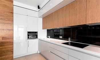
Modern style allows you to create inspiring interiors, and the kitchen should not be an exception. The modern kitchen is dynamic, has clear, sharp lines, characterized by the use of smart ideas for rational storage of things and creating a pleasant look. Each corner of the cooking area should be well lit by natural light, if possible. Ideally, the kitchen should be separated from the dining room and living room (so that the smells of cooking do not “drift” throughout the house), but at the same time remain easily accessible.
For those who are preparing to seriously change the look of their kitchen, on their own or with the help of professional designers, many questions arise. And some of them, the most common, we will answer today.
How much will the new kitchen design cost
There is no reason why a kitchen design in a modern style should have cost more than interiors in other styles. The beauty of a modern interior lies in its functionality. You do not need to spend money on unnecessary decorations, that is, theoretically, the design of the kitchen should cost you even cheaper. Regardless of the style chosen, however, kitchen design is a major investment, so be careful when developing your own projects, seek help from professionals.
What points should be paid special attention when starting to develop a kitchen project
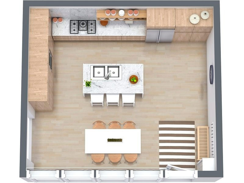
Light is crucial in the design of the kitchen, no matter in what style it is decorated, because when preparing food it is very important to clearly see everything. And in this case it is not only about lamps: think about the placement of windows, the color of walls and cabinets. An important aspect is the availability of free space. So that the whole family can get together at the dinner table, the kitchen should not be small. And if young children run around, then safety should be a serious criterion. A good modern kitchen must be highly functional, and its beauty stems from this quality.
Do I need an island table in the kitchen
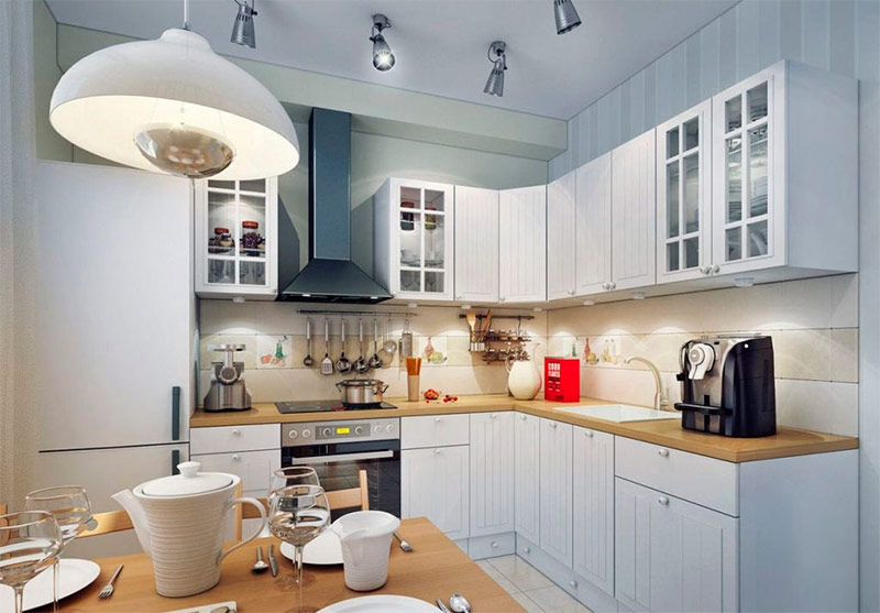
It depends on your taste! For some people, an island table will become an unnecessary expense item and will bring only inconvenience, restricting movement in the kitchen. For others, having extra space for prima food is a vital aspect that turns a kitchen from just cooking space to a place to chat with your loved ones. If your dining room is far enough from the kitchen, then the island table can be the perfect complement. However, if you have a small kitchen, then trying to squeeze an island table into it can ruin the harmony of design, which should be avoided at all costs.
Which kitchen worktop to choose
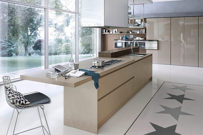
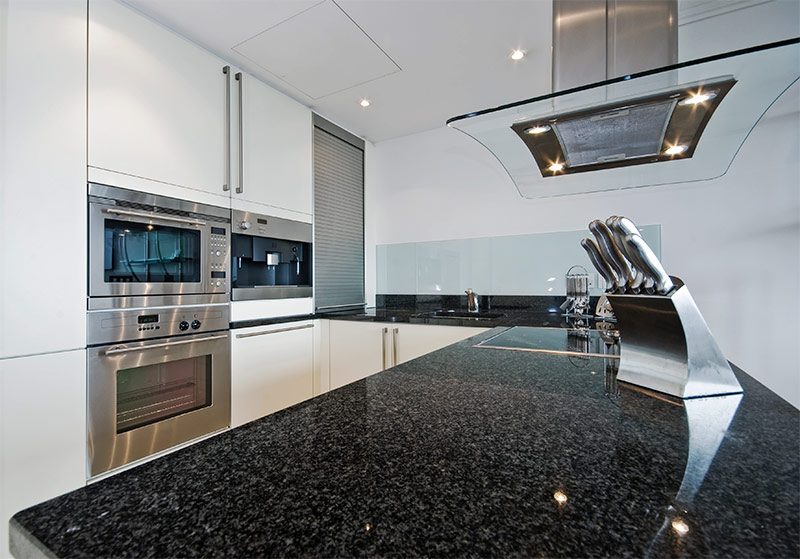
The countertop serves as a work surface, and it must be extremely functional. There are many materials for making countertops that combine this functionality with beauty: polished granite, stainless steel, wood, etc.In general, an ideal countertop should be easy to clean, durable and fits well into the overall design. Do not buy an exotic countertop, simply because it looks great on its own. How will it look in your interior? One inappropriate element can upset the overall balance.
The best ideas for modern kitchen design
Almost any homeowner can do a simple redecoration of the kitchen to transform the old space, to make it look new.
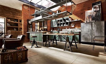
Kitchen design is an ever-changing field with an almost infinite variety of different styles. You can choose a clean white interior that resonates with science fiction spaces, or create a modern industrial-style kitchen with heavy use of metal. With brickwork, you can achieve elegance and add some kind of rustic charm, and the right selection of colors will help create a space that is pulsating with energy and charm. The main thing is to correctly design the space, and even the decorative elements will become those small touches that are necessary to complete the planned picture.
For those who want to make their kitchen unlike any other, we offer several modern design ideas. If you make creativity your main ally, then your updated kitchen will undoubtedly start to delight your household and neighbors.
Light and color
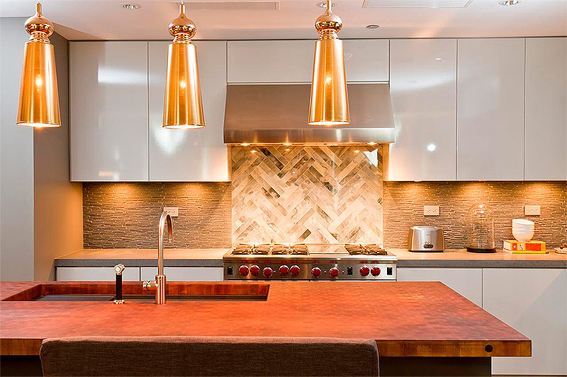
Natural shades used in the design of this kitchen create a good balance of male and female accents, which means that any family member will like the interior. The pleasant texture of the stone countertops and the kitchen apron looks great against the background of the smooth surfaces of the cabinets. The warm shade of the working surface of the island table, used both for cooking and for receiving guests, gives the space a special depth.
The effect created by the steel surfaces of household appliances is enhanced by translucent gold pendant lights. Finally, the additionally illuminated smooth marble pattern of the kitchen apron behind the stove brings a new texture and a new color combination to the interior.
Honeycombs
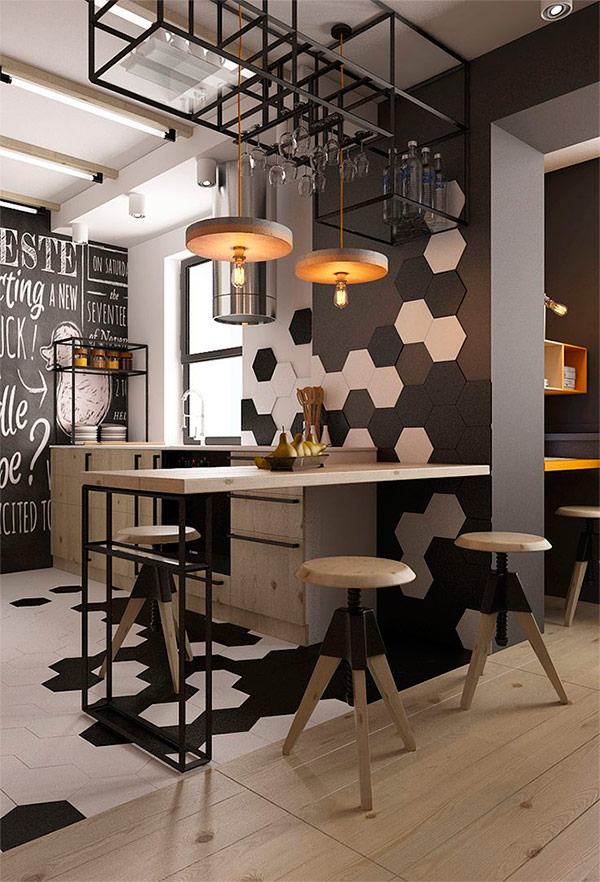
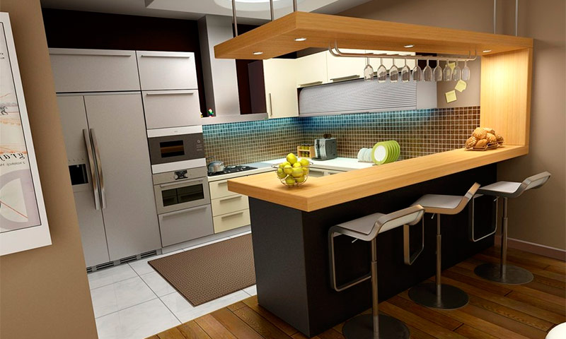
This classic industrial interior with modern design elements “saves” on color, but not on style. A black and white pattern in the shape of a honeycomb flows smoothly from the floor to the wall, thereby easily connecting parts of the space together. The natural purity and beauty of the unpainted wood used to make stools, countertops, kitchen cabinets and pendant lights gives a little rest from this slightly dark black and white painting.
The presence of space for storing glassware above the peninsular table allows you to significantly unload kitchen cabinets. The lack of variety of colors in this interior is offset by its design features.
Fluttering butterflies
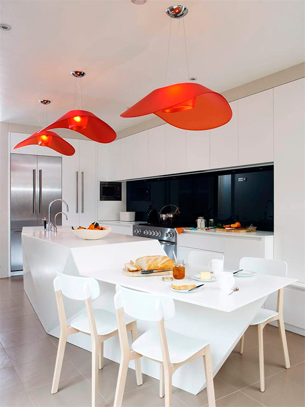
Against the background of clean, smooth white surfaces of this interior, dark amber lamps in the shape of butterflies look great. Due to its polygonal shape, the modern kitchen island table made of corian is unique - it does not look like its counterparts with their monotonous right angles.
The unusual material of the kitchen apron makes it look like a window, in fact it is tempered glass painted in dark black. Such an “window” apron visually expands the space, otherwise the room would seem too narrow. Built-in storage space both in the island table and in cabinets located against the back wall, allow you to hide from your eyes everything that is not needed at the moment.
Spheres
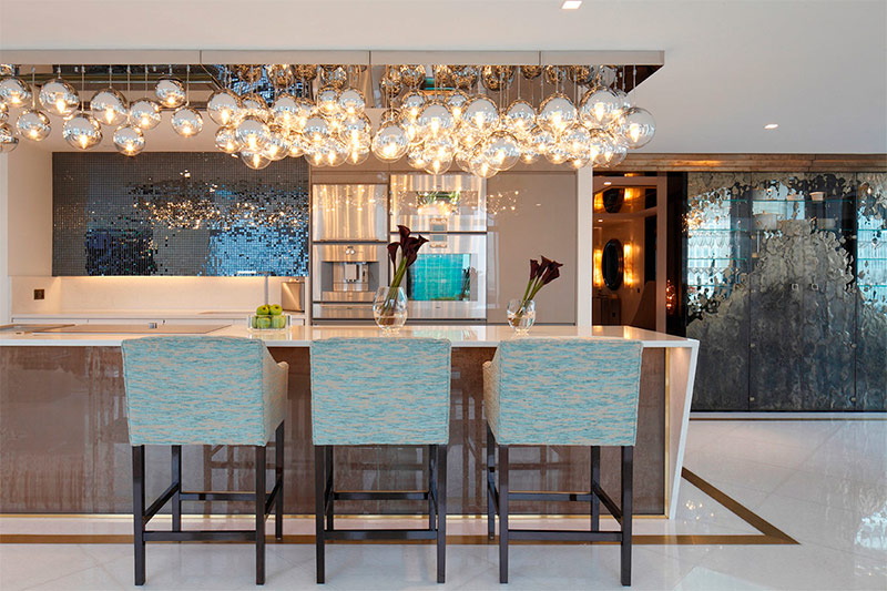
At first glance at this room, it is difficult to guess a full kitchen in it, because all household appliances are skillfully hidden from view.Due to the unusual design of the island table and materials that are not usually used in the design of the kitchen, guests may have the feeling that they are sitting in a bar. Another feature of this kitchen is an exquisite set of chromed glass ball-shaped lamps above the table, filling the room with warmth. Dark mirror tiles on the kitchen apron deepen the back wall, and blue chairs add a soft feel.
Chocolate Marble Cake
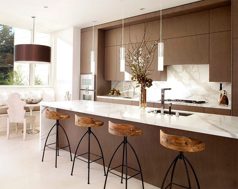
One look at this kitchen brings to mind the mild taste of chocolate-marble cake. The sweet chocolate brown color of modern kitchen cabinets contrasts sharply with the smooth glazed texture of marble countertops and an apron. Bar stools on cast-iron supports with seats made of material with a texture and color resembling a cork add a touch of rough roughness.
Thin silver-glass pendant lights in a line make the room visually less wide. Large windows provide the kitchen with the ideal amount of light to emphasize the openness of the space.
Unfinished dream
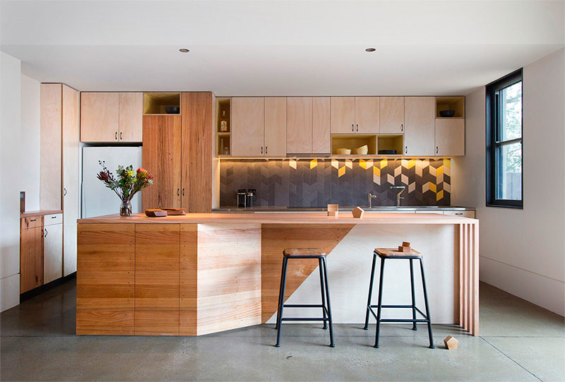
This project at first glance seems incomplete: for many, this interior will surely evoke memories of the school workshop and labor lessons. But the raw wood is undoubtedly the highlight of the bright space. A kitchen apron with a chevron pattern sets the color scheme of the interior, deepens the space, emphasizes the natural color of the wood in kitchen cabinets.
The bluish-gray apron tile blends incredibly well with light yellow and cream. Focusing light on individual cabinets and the front of the island kitchen table completes the big picture. This design proves that the knots and fiber structure of the wood are enough to transform the space.
Color blocks
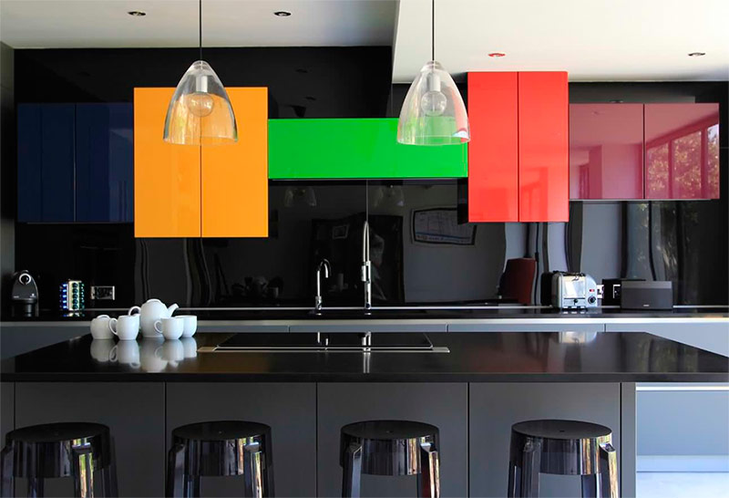
Contrast is what unites this space. Bright spots of color flashed on the black and gray scene. All surfaces are smooth and shiny, either due to the nature of their material, or as a result of applying a thick layer of glassy varnish. The perfect color choice allowed the designer to create a space that would otherwise be lost in the dark.
The use of bright contrasting colors on a plain and slightly dull background is the key to creating a memorable space. Transparent glass pendant lights provide good lighting, but do not distract from the intended focus - colored blocks. Skillfully placed white accessories (in this case, a tea set) add a little dimension to the foreground to visually separate the island table from the back wall.
Sculptural beauty
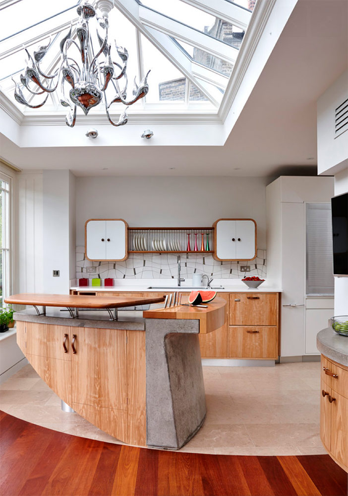
When decorating a modern kitchen, unusual materials are sometimes used. Many designers in recent years have begun to use concrete for the manufacture of texture worktops. However, few people came up with the idea of including it in the structure of the island kitchen table. The combination in the construction of concrete, stainless steel and wood made it an independent work of art.
The table top is a surface ideally suited for cutting meat and slicing vegetables, it is not surprising that this is where a place is provided for convenient storage of knives. Modern kitchen cabinets on the back wall, providing rich storage options, do not distract from the focus on the magnificent island table. The partially glazed roof is an ideal source of illumination in the daytime, in the evening a giant silver sculpture chandelier will be included, which is another work of art that brings a touch of modern style to the interior of the kitchen.
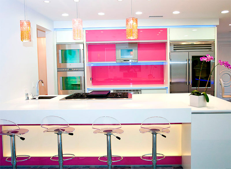
Fusion Fuchsia
At first glance, this space may seem like some kind of futuristic diner. Nevertheless, this is a vivid example of the fact that the ideas of modern cuisine can be based on both classical and revolutionary design styles.Vibrant white and purple are undoubtedly the ruling colors in this space. The purple accent on the insertion of the dining island table adds a pleasant flush to the color of the area that might otherwise have blurred. Amber pendant lights add a third dimension to the two-tone color scheme. A similar triad of shades can only be described as striking.
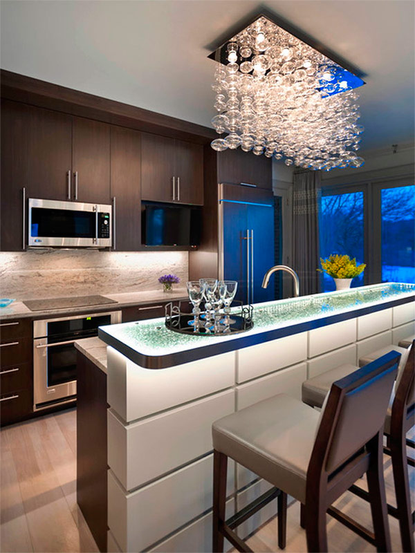
Espresso Elegance
This kitchen, with its deep tones, proves that the color of espresso coffee has not yet gone out of the interior fashion. The timeless combination of stainless steel and brown shades lends itself well to transforming the back wall with its beautiful marble apron and countertop. To create a bright focus in the interior, the designer decided to illuminate the space in two unusual ways: there is also a hanging chandelier, consisting of hundreds of oblong transparent glass balls, and a highlighted countertop made of frosted glass.
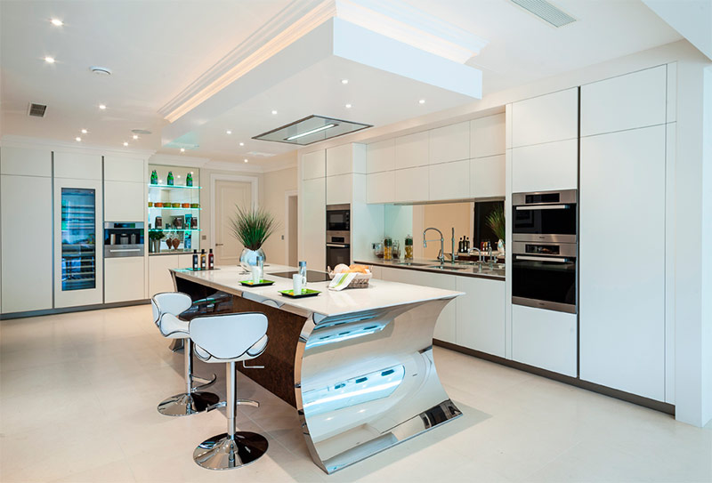
Mirror
The openness of space is often its greatest value. To make this room look even larger, the designer used several reflective surfaces. Mirrors are located above the tabletop instead of the traditional apron, and behind the open shelves, which not only serve as a place for storage, but also perform a decorative function. Thanks to the reflective surfaces, it seems that the kitchen extends beyond its walls.
In addition, mirrors increase the brightness of space, repeatedly reflecting the light coming from various sources. The white color of the cabinets along the walls makes the room seem even cleaner than it actually is. However, the true attraction of this cuisine is an unusual island table. The curved ends of polished steel continue the reflective theme of space, and the dark front surface of cork wood adds good contrast to snow-white cabinets.
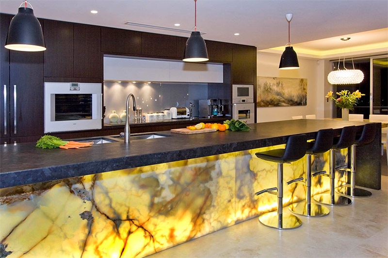
Glowing marble
What is the main feature of this kitchen, it becomes clear at the first glance at it. Bright illumination of the marble front surface of the island table creates the right mood for a relaxing pastime. The back wall with its magnificent cabinets in dark shades provides the kitchen with ample storage space.
The matte metal surfaces of kitchen appliances and the soft gray color of the apron do not distract attention from the marble island table, but at the same time emphasize the overall elegance of the design. A large tabletop made of dark stone provides an extensive area for cooking or for gatherings with friends. An excellent addition to the overall picture are black industrial-style pendant lights and black leather bar stools.
Sea away from the sea
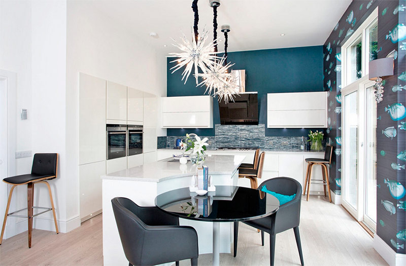
Modern kitchen interiors are often the result of a fusion of elegant space with bizarre elements. This design is no exception. The unity of the white walls, cabinets and island table is broken by a turquoise accent wall. The kitchen apron, where stones of blue, white and silver colors are mixed, resembles the ocean waves on the beach.
The semicircular cutout on the island table creates an ideal place for two who decide to have breakfast in such a romantic setting. Lamps in the form of sea urchins not only provide space with soft light, but also help to make a room with too high ceilings more comfortable. Another interesting addition to the design is the wallpaper with the image of fish on the side wall. This wall brings an element of quirkiness to the room, which otherwise would have been just another modern interior.
Back to the forties
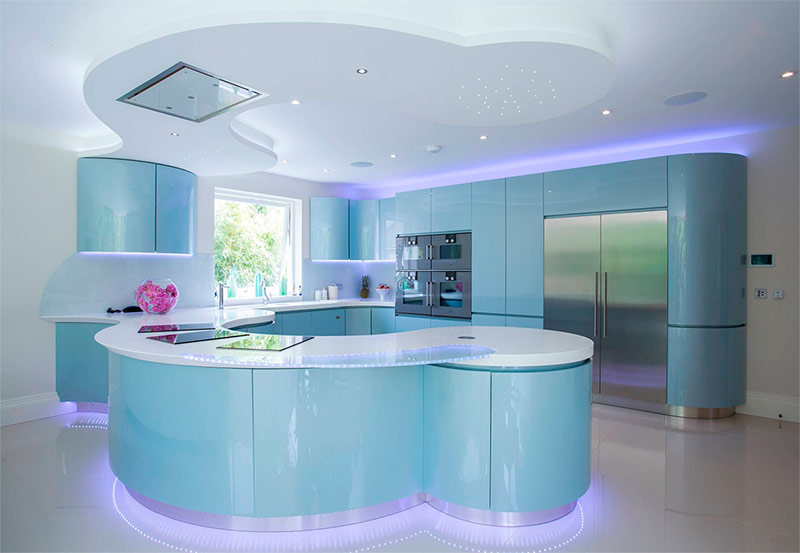
The shiny emerald surfaces of cabinets and the island table in this kitchen evoke a slight sense of nostalgia for bygone times.This almost translucent blue color is reminiscent of the shade used to color household appliances and accessories in the 1940s. There are no sharp corners in this space.
Rounded edges evoke memories of cars and planes of that decade. LED lighting throughout the room provides soft, neon-like light. This interior serves as a confirmation that the basic design elements of the past days have not gone completely, but transformed into new elements used by modern designers.
Black and bright energy
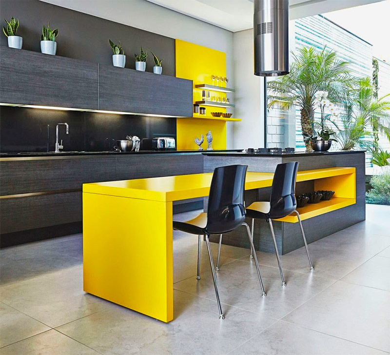
Through the darkness of the dark color palette of this kitchen, a bright yellow energy breaks through. Almost the entire far wall is occupied by cabinets decorated with black veneer and black countertops, but this blackness is broken by an accent bright yellow. In the dining area of the island table there is the same splash of yellow.
Both yellow inserts are painted with glossy paint, which further increases the level of energy. A beautiful cream-colored marble floor tile creates a pleasant contrast to dark cabinets and bright yellow elements. This design is a great example of using two contrasting intensity levels in one space.
Arc foot
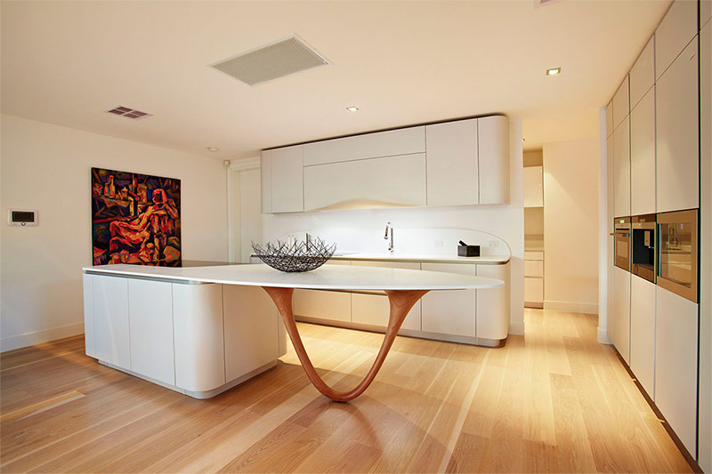
Like many other modern kitchens, this space makes the island table the center of attention. The cream-colored storage cabinet is skillfully integrated into the side wall, which saves space while maintaining functionality. Furniture with rounded shapes against the back wall is painted in the same cream color.
The designer deliberately did not use a color scheme that could distract from the main attraction of the room - the legs of the island table of a bizarre shape. Of course, it would be possible to lean the tabletop of an island table on a more traditional cylindrical or multifaceted leg, but the designer decided to use a magnificent piece of wood in the form of an arc as a support. The cedar shade of this beautiful wooden detail blends perfectly with light wood flooring.
Pamper the chef
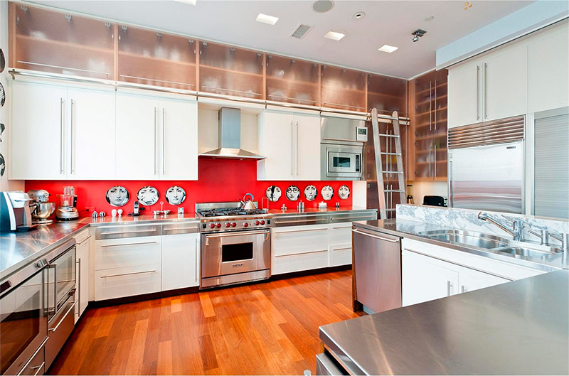
Efficient use of space is one of the fundamental principles of modern design. This almost professional kitchen demonstrates how to preserve the full functionality of the space without compromising on the quality of the design. Skillful use of the space above and to the side of the daily work area allows you to keep all the necessary tools at hand. The glass doors of these storage spaces provide contrast with lower-level wall cabinets.
A staircase, similar to those used in libraries, allows the chef to easily access everything he may need. Stainless steel appliances occupy a significant part of this kitchen, but they do not seem like a foreign element here, since they form a single whole with countertops made of the same material. A bright red apron brings a pleasant splash of color to the interior, which otherwise might seem somewhat sterile, and vintage plates hanging on this apron add emotion to the room.
Impeccable modern kitchen
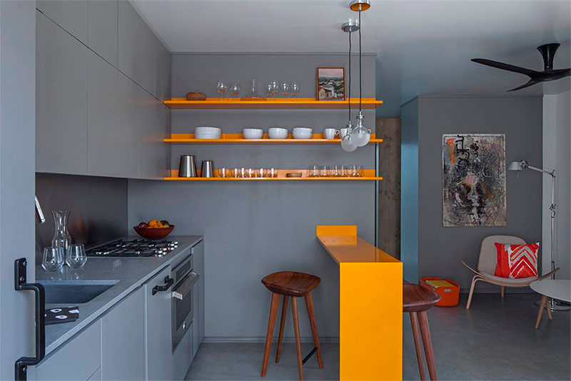
The interior of this kitchen is a clear demonstration that the gray color does not seem monotonous and boring with the right approach to design. Bluish-gray tones “spread” here everywhere - from cabinets to walls and floors. Bright orange wall shelves and a miniature bar counter add some vibrancy to this interior. The stainless steel apron goes well with a gray countertop. The image is completed by two semi-matt lamp-lamps, which serve as a light source in the dining area.
Splash of sophistication
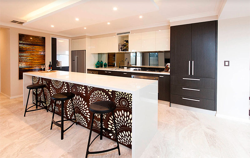
In this kitchen, white lacquered upper cabinets and dark matte lower cabinets help to draw attention to the lower part of the space, and hence to the unique island table.The glossy legs and countertop of the island table is a frame for the front-mounted magnificent laser cut screen.
The color of the screen matches the color of the lower cabinets. In order not to distract attention from the island table, the designer, using the built-in backlight, increased the illumination of this zone. The mirror apron also helps reflect natural light to make the space even brighter.
Layering
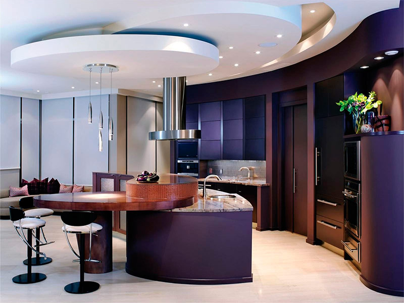
The three-dimensional technique used in this kitchen combines various materials together to create a sophisticated effect. This technique starts from the ceiling, where various rounded shapes descend lower and lower as their radius decreases. This spiral ends at the lowest point with a stainless steel hood and the same pendant lights. Another set of measurements rises up from the island table - first a marble countertop, then a pretty wooden part that serves as a relaxation area, and, finally, the topmost element, less functional, but still necessary to create a complete image.
The designer used the layering technique in the color palette. Different shades of purple overlap each other on the back wall and cabinets. This kitchen interior in a modern style clearly demonstrates that the concept of layering is not only for clothes.
Tea cup
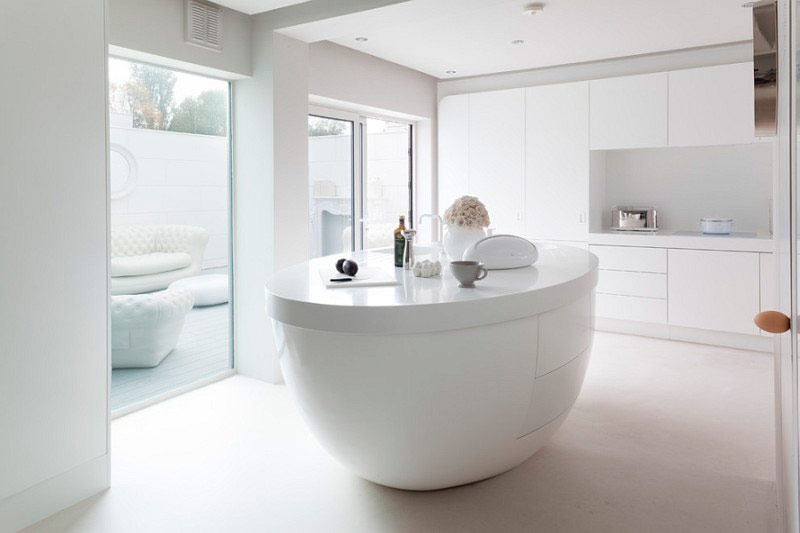
The minimalism of this interior ensures that the creative island table does not go unnoticed. Thanks to the whiteness of the walls, cabinets and floors, this table seems simply gigantic. The shape of the island (did you notice its resemblance to a tea cup?) Is truly unique, but thanks to the inclusion of storage spaces and a sink, it has not lost its functionality. The minimalistic design is transferred to the patio next to the house, which means that large windows will not allow any elements that do not meet the concept of minimalism to “leak” inside.
In the spotlight
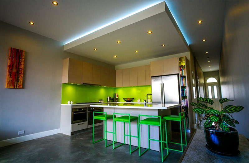
The bright lime green color used in the interior of this kitchen attracts attention and makes the space visually larger. Wooden facades of wall cabinets create a nice border between the gray-blue color of the wall and the bright green color of the apron.
The lack of a useful surface in the form of countertops is compensated by the presence of a large island table, which also serves as a place to relax. Almost neon bar stools carry the accent color of the wall inside the room. The gray color of the walls and the front surface of the island table perfectly complement the brightness of green. A backlit two-level ceiling helps visually separate the kitchen from the rest of the open-plan space.
Cedar hug
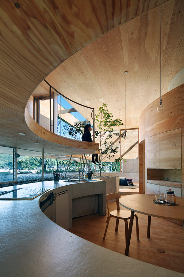
The round shape of this room is designed to provide a sense of security. Walls covered with cedar panels enclose the space in a warm embrace. Bluish gray countertops made of painted concrete. The area behind the kitchen counter serves as a huge tub filled with earth and stones, allowing trees to grow right within the living space. Huge multi-level windows guarantee an abundance of natural light indoors, but you can’t do without simple pendant lights - they will illuminate the space in the evening and at night.
Brick and mortar
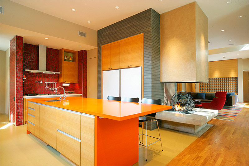
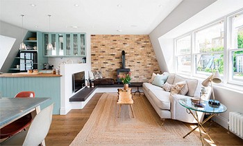
Modern design does not neglect the ideas of other styles and materials that have been used for centuries. This interior is one example of how these materials can be combined with modern ones. A beautiful gray brick wall fills the side wall of the kitchen and flows smoothly into the adjacent living room.
Another wall, faced with mosaics resembling a classic red brick, brings a warm color to the kitchen. The orange worktop on the island kitchen table combines brick red and gray in a coherent whole. Red and gray could, mixed together, become the background, but orange makes all three colors equal participants in the triad.Located on the border of the kitchen and living room, a fireplace with a unique wire sculpture became the finishing touch of this interior.
Polished surfaces
Smooth, polished surfaces play a major role in modern design, and this kitchen is no exception. From the island tabletop made of stainless steel, the look smoothly moves to the same polished front panels of the cabinets. Other surfaces are as smooth but not glossy.
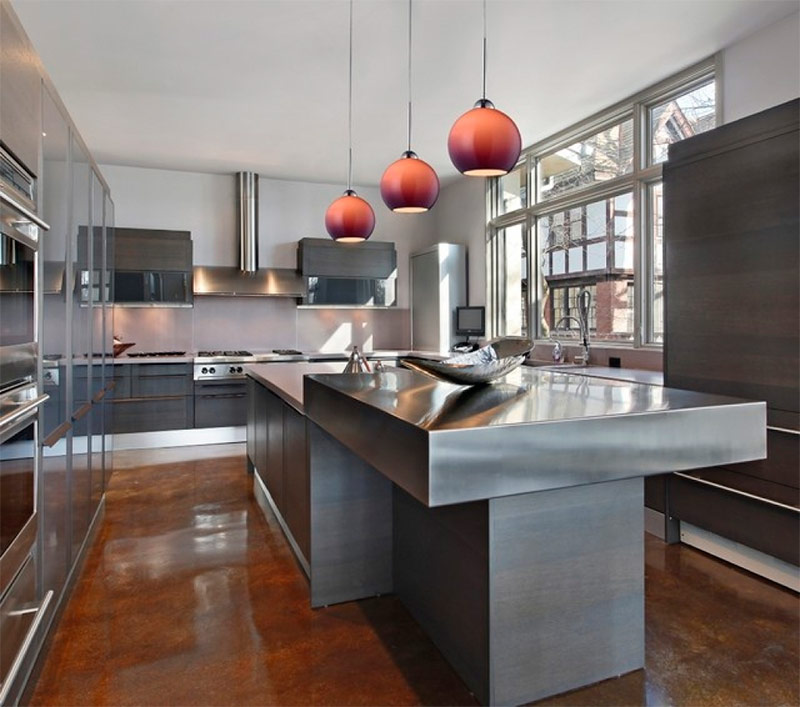
Polished to a shine and concrete floors, painted in deep brown. All kitchen appliances have been selected very carefully, so that it matches the environment and easily fits into the space. Ombre pendant lights are placed above the island table, adding a reddish accent to the interior.
Cozy Bay
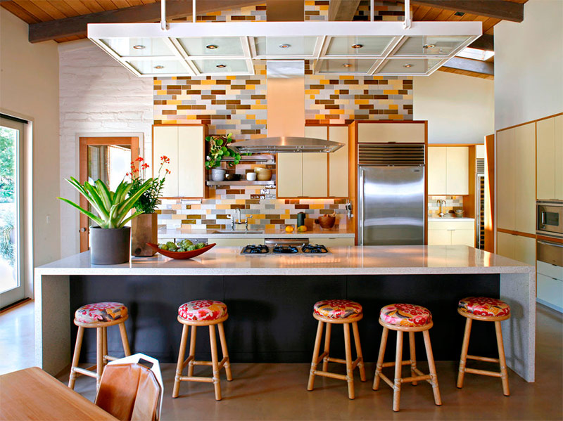
Some kitchens simply remind us of home comfort, soothing and warm. The designer of this interior managed to evoke this feeling by mixing vintage styles with modern elements. Brick tile is a classic element that the designer used to create a modern mosaic of various brown shades on the back wall.
Vintage-shaped cabinets are a tribute to the classics, while kitchen appliances and a stainless steel exhaust hood add a touch of modernity. A two-level ceiling with integrated lighting combines old and new styles to create a unique look. Bar stools upholstered in vintage fabric against the backdrop of an island table made of corian give rise to a feeling of home comfort.
Interspersed green
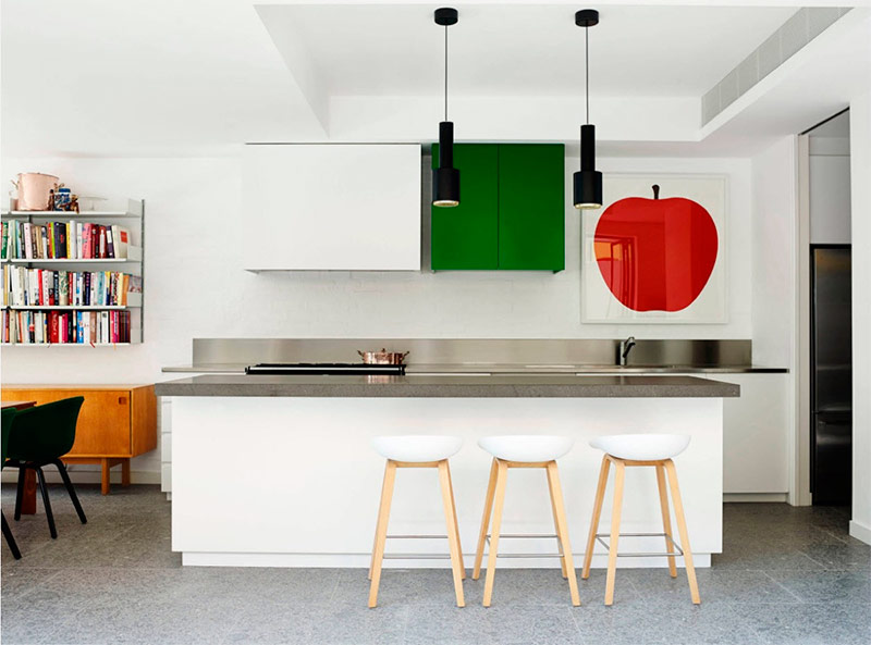
To be modern, a kitchen does not have to be extravagant. Even small spaces with the right design can take on a modern look. The designer of this kitchen with white walls and white furniture succeeded. The island table with a gray granite worktop has a dual function: it serves as a place for cooking and a place to relax and socialize with friends and family.
The real power of this space comes from the dark green color of one of the cabinets on the back wall. It, in combination with the red image of the apple, provides a sufficient amount of color needed to turn the space from pale and weak to energetic and daring. As you can see, creating a complex design is easy.
Wooden miracle
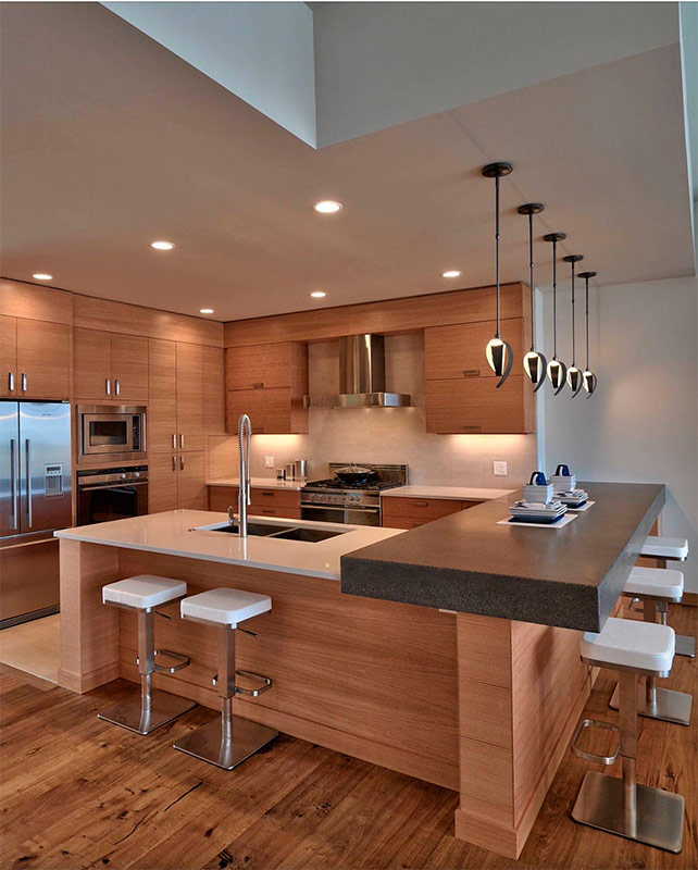
The grace of light wood, the solidity of the dark bar and the creamy lightness of countertops and an apron create a striking combination in this space. The wooden surfaces were left unpainted, which allowed the ideal structure of the wood from which the cabinets and the island table are made to shine in all its glory. Wood surfaces themselves can be from any design era, but modern stainless steel countertops and appliances are a clear indication of modernity. Bar stools and skillful pendant lights are fully consistent with the modern style of the interior.
Cuba
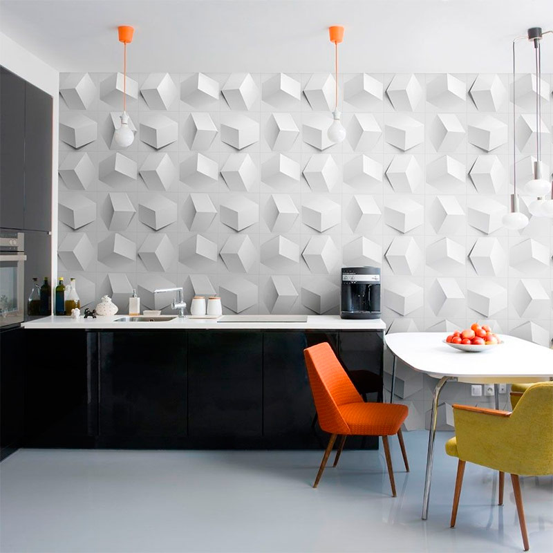
Originality is the most common phenomenon in modern design. The wall panels used in this interior guarantee the uniqueness of your design. Here three-dimensional cubes "jump" out of the wall in random directions. Shiny black cabinets and white countertops allow you not to be distracted from contemplating this geometric miracle. Bright orange spots were brought into the room with pendant lights and upholstery of one of the chairs, and the golden color of the other chair complemented the palette.
Solution for a small kitchen
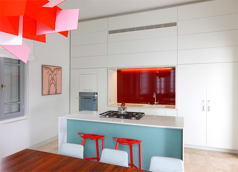
Small kitchens can be difficult to give a decent modern look. The designer used two interesting tricks to create a modern small space. Firstly, the efficient use of space not only guarantees a sufficient amount of space for storing kitchen tools, but also makes the space visually larger. The designer created as many built-in repositories as space allowed him.
Extending the closets to the ceiling makes the room look much taller than it actually is. Secondly, maintaining a minimum of background tones opens the room, while the use of small areas of bright accent colors adds depth to the room without reducing the space. The light blue color on the front of the island table keeps the palette cool. The dark red apron adds an extra dimension to make the room look as if it is going deep into the wall.
Grid
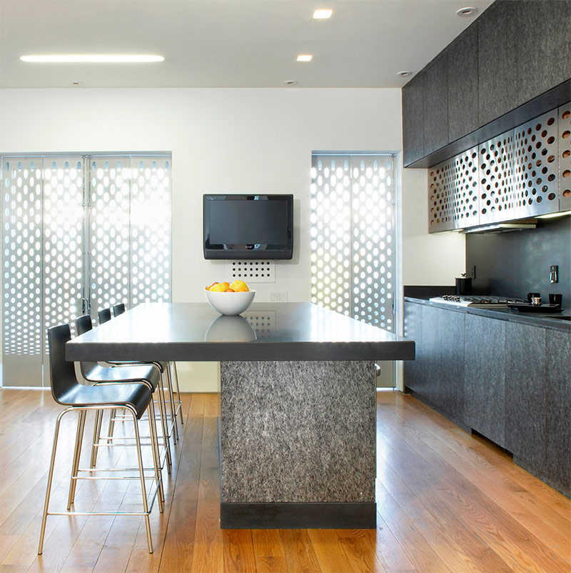
It is rarely possible to meet a metal mesh in the kitchen, but this interior serves as an example of the fact that, when used correctly, it can make a simple space quite original. As a complement to the light wooden floor, the designers chose dark furniture. All side surfaces of the cabinets and the island table are covered with granite veneer - a typical material for countertops.
Around a massive table topped with a marble slab, a fairly large company can freely accommodate. Stainless steel mesh is the front panel of the lower level of hanging cabinets. A grid of the same style is used as window shutters. The combination of materials not commonly used in kitchen design creates a unique look for this space.
Jade on a black and white background
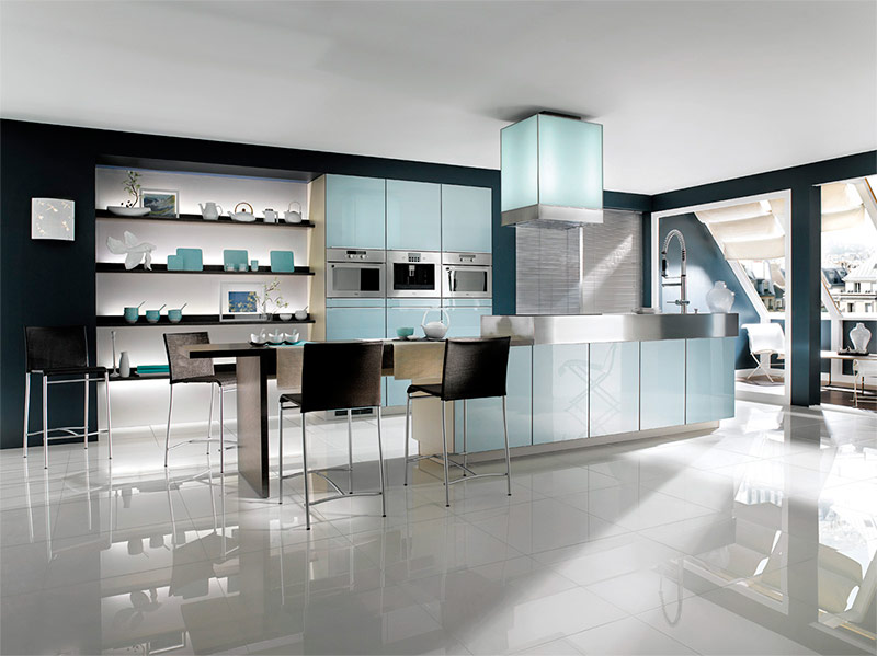
The black and white elements of this room provide a pleasant backdrop for contrasting jade accents. Design begins with the deep black color of the walls. White is opposed to black - white walls of built-in shelves and smooth white floors. The stainless steel kitchen appliances and the emphasis on the island table provide a new design texture. However, the true beauty of this kitchen is the jade lighting and jade accessories on the shelves.
The jade green acrylic panels facing the back wall, the hood housing and the front surface of the island table, thanks to the LED backlight, emit a soft green glow, very similar to the fluorescence of antique uranium glass. Everything feels Asian influence - from the color scheme to the choice of accessories.
Close magnificence
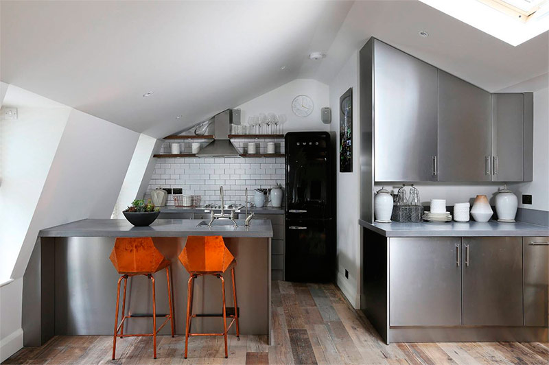
The tightness and unusual shape of the room can seem like a serious problem when designing. To visually increase the space, the designer used stainless steel. Its reflective surface provides optical depth and repeatedly reflects light. Often mirrors are used to increase the space, but in this case this is not the best solution.
Due to the unusual shape of this room and its unique orientation in space, surfaces with high reflectivity would turn this room into a mirror labyrinth. The brick-shaped tile in the background helps the room look wider, and dark grout lines separate the back wall from the white side wall. Using a black refrigerator prevents stainless steel from becoming overwhelming. The parquet, imitating old boards, laid along, creates the illusion of increasing the depth of space.
Glamor in gray tones.
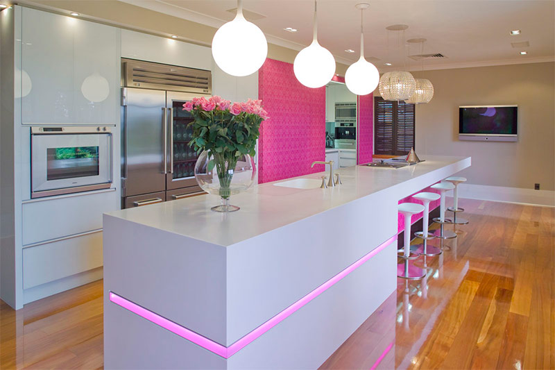
The magnificent gray color, combined with pink and fuchsia, creates an atmosphere of glamor in this kitchen. As a rule, the space in gray tones seems more manly, but here the glossy finish of the furniture facades adds an appearance of femininity enough to make the style glamorous.
The island table, which otherwise would have looked too simple, is accented with pink inlay, cutting the gray plane in half, and exquisite fuchsia wallpapers make both the back wall and the front surface of the island table stand out. The hard right angles throughout the room contrast with the round balls of lights above the table. The two crystal mini chandeliers above the dining area add a touch of elegance and serve as a softer light source.
First class cuisine
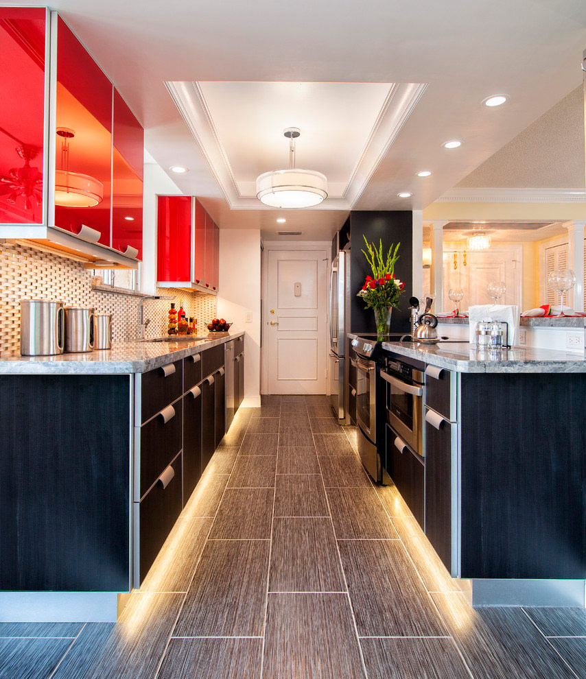
In this space, the inspiration of a great lover of long-distance travels is clearly traced.The curved handles of the stainless steel cabinets resemble those provided with the upper shelves for hand luggage in a luxurious airliner, and the shape and acrylic lining of the red hanging cabinets evoke memories of the moving containers with which cabin crew carry food around the cabin.
The magnificent lower cabinets, trimmed with dark veneer, attract the eye to the floor from the dark gray wood-like tiles. The lighting of the cabinets below, next to the floor, resembles the lights of the runway. The unique apron wall, consisting of small rounded convex tiles, is also associated with a chic airplane. When creating a modern interior, inspiration can come from anywhere, and the idea of a good designer is clear, like a frequent blue sky.
XXII century cuisine
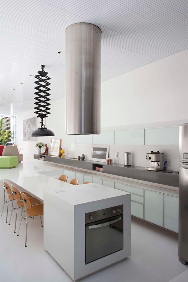
The futuristic architecture of this house has become a design element that is used to combine in a creative form the kitchen and living room in a modern style. The color scheme is closely related to minimalist standards. However, in addition to white, stretching across the entire space, there are other colors. A large gray shelf, separated from the lower cabinets by a distance of about 15 centimeters, stretches along the entire wall and serves as a countertop.
A stainless steel range hood and kitchen appliances and a black folding lamp extension also break the white space. The most unique aspect of this interior is the presence of an open room adjacent directly to the kitchen. The floor of this room rises about half the height of the kitchen walls, and to get there, you need to overcome the stairs in several steps. The top of the dining table is actually a continuation of the floor of this room - the two spaces are combined, while remaining a bit separated. Large windows in the living room provide good lighting in both spaces.
Living forest
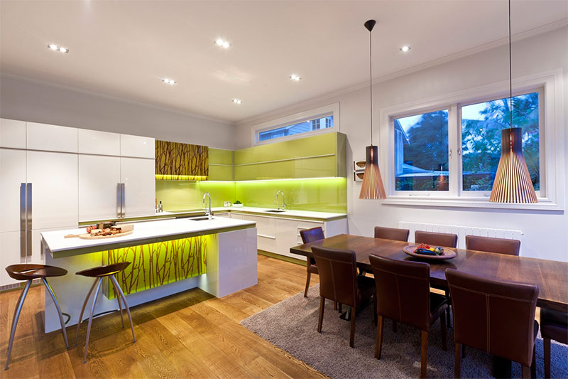
An open-plan island table is used to separate the kitchen area in this open-plan house. A play of white, chocolate-brown and greenish-yellow colors is a pleasant combination to the eye. Large white cabinets provide ample storage space without distracting attention from other design elements. Pale green cabinets and an apron are a great addition to white "neighbors" and countertops.
The same beautiful green chartreuse is included in the design of the island table. The true attraction of this interior is the stencil drawing of chocolate-brown trees on the facade of the island table and on one of the green hanging cabinets - a kind of work of art. Most of the light in the room comes from built-in ceiling lights, as well as lights under the wall cabinets and under the island table, but there are retro-style pendant lights above the dining table.
Black and white and red
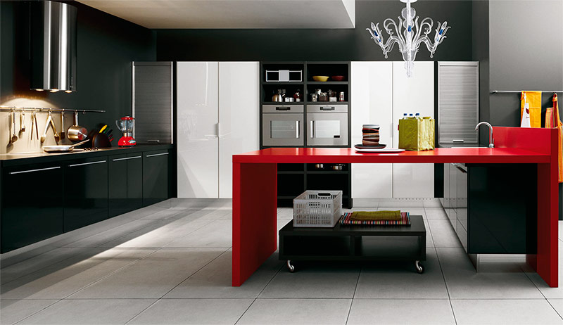
In the old days, a black room would not have been approved by the owners of apartments and houses. However, in modern design, black is no longer something out of the ordinary. The dark walls and cupboards in this kitchen help make the large space seem even bigger. White storage cabinets along the back wall destroy the black darkness.
Stainless steel rolling doors in every corner are an unusual design element that is not usually found in home kitchens. The bright red island table is ideal for both cooking and eating. The use of glossy paint on all cabinets, doors and the island table creates a fresh, modern look. A futuristic fume hood with built-in lighting and a highly artistic chandelier above the island table provide illumination of both ends of the room.
Spotlight - beautiful view from the window
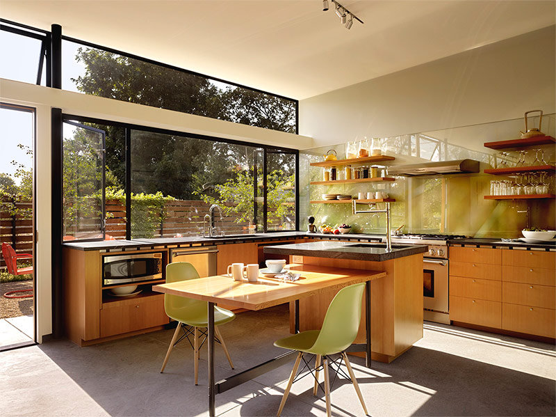
This kitchen with full-wall windows is the very embodiment of openness. Instead of hanging cabinets, which may limit the view, the designer chose open shelves.They are placed on a kitchen apron made of transparent acrylic, allowing you to see the original color of the walls. The island table provides a place for cooking, but most of it is reserved for the dining area.
Plastic chairs with wooden legs repeat one of the many green shades that are visible through the crystal clear windows. With so much natural light, the designer decided not to bother with artificial light and placed only a simple set of track lights in the center of the room. The simplicity of the design of this room does not damage the view from the outside.
Warm winter day
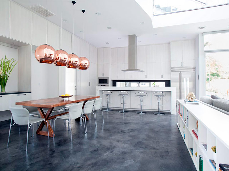
White walls, cabinets and racks create a blizzard of beauty in this kitchen combined with the dining room. The large dining table with marble top easily accommodates 8 people. Although this table formally separates the kitchen from the dining room, these areas still remain a single entity.
Four brass lamps hang from very high ceilings, providing a sense of privacy sitting at the dining table. Cubic racks located in the dining room provide additional space for open storage of books and decor items, allowing you to personalize the space. Painted and polished concrete floors provide the foundation for a clean, white winter scene.
Memories of the vegetable market
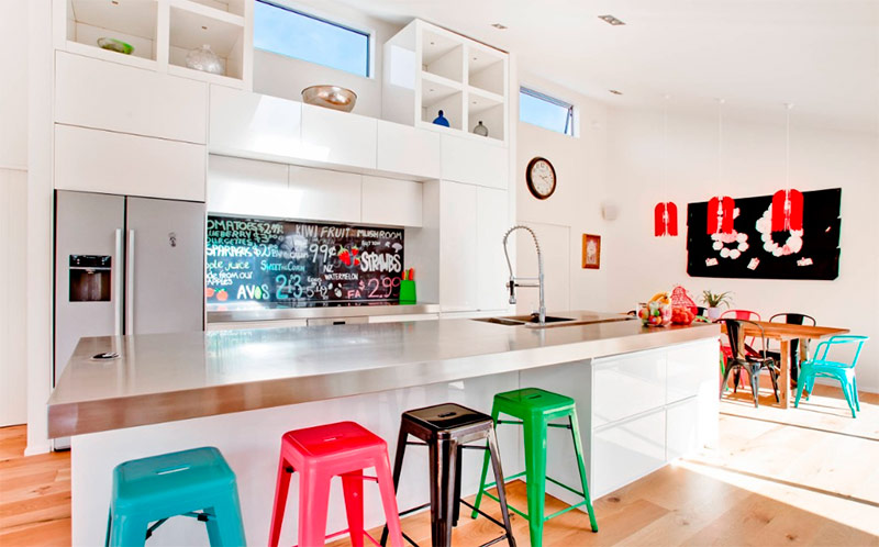
Built-in white cabinets and racks, reaching the high ceilings of this space, make it possible not only to store everything you need, but also to expose numerous designer accessories. An apron made of a board with the name and price of fruits and vegetables, like those used on the market, has become perhaps the most fun and unique design element. The same bright colors as the text on the apron, painted bar and dining chairs. Stainless steel countertops and light pine floors are also associated with the market.
Polished black
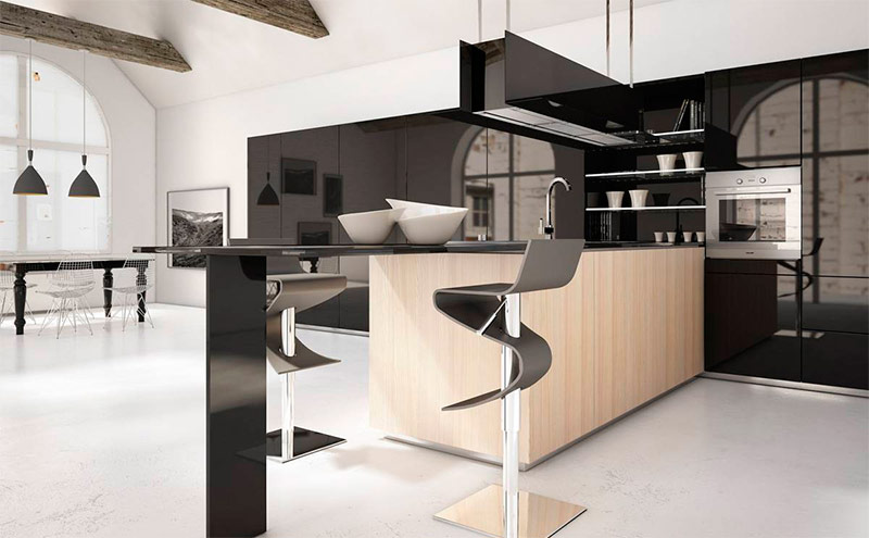
Black acrylic cabinets and panels that fill almost the entire wall give this space a modern, sexy feel. The contrast of white and black clearly visible here adds sensuality. The light wooden lining of the island table softens the confrontation between these two colors and even helps them get along. Zigzag bar stools add to the seductive character of the room.
Yellow spray
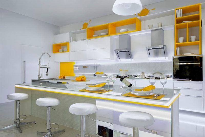
Modern design is omnipotent: a fairly simple space can be significantly improved by adding an equally simple element to it. The bold bright yellow color that appears here and there in a splash on a white background creates the perfect picture on a seemingly empty canvas. Imagine this space without yellow accents, and you will understand the true role of bright color in the interior.
This bold move continues with two funny images of paint splashing over the cabinets; thanks to these yellow blots, the design is not taken too seriously. The mirror table top of the island table and modern bar stools serve only to give the space an even greater personality.
Naked brick
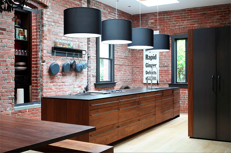
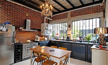
Brick walls are the perfect backdrop for a modern kitchen. This material is perfectly combined with so many colors and textures that it is simply difficult for a designer to make a mistake. The dark wood in this kitchen emphasizes the dark red color of the brick, as a result of which the classic combination begins to look new. The black color of the countertop, the facade of the cabinet and other auxiliary elements corresponds to the tone and texture of cast iron.
This is done in order to recall the days when brick was the most common building material. Looking only at these elements of the interior, it is difficult to determine its true age - it is not clear whether we are looking at some old photograph or is it a modern design. However, lamps with large black lampshades leave no doubt that this is a 21st century kitchen.
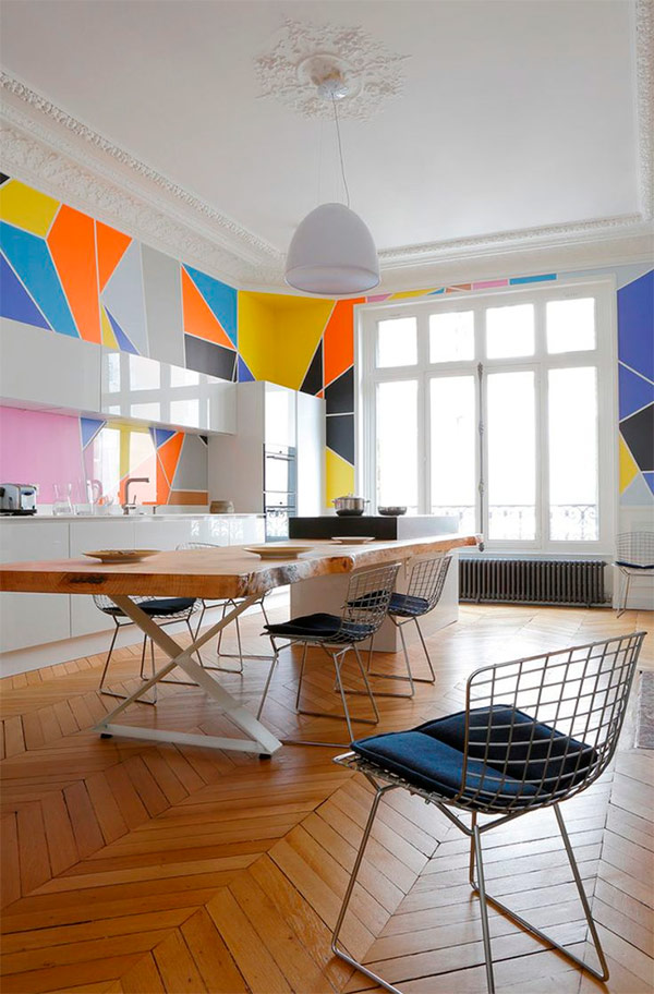
Geometry
Geometric shapes have been used in design for several decades, but then interest in them has somewhat subsided. Today they are back on stage.Simple white wardrobes literally transformed thanks to randomly arranged geometric shapes. This is a revival of the art deco style of the 1920s, but the bold colors of the time in modern design were slightly muffled. The chevron pattern of the wooden floor adds an element of classic to the interior and draws attention to the large open window at the end of the room.
Graceful Two-Tone
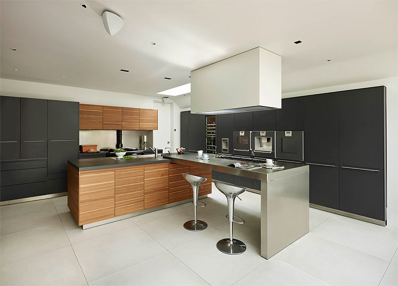
Black cabinets in this space stand out against the white walls. But the most pleasing to the eyes here is the design of the wooden cabinet and part of the island table - a sort of mixture of dark and light wood with the horizontal orientation of the boards. The second part of the island table, made of stainless steel, together with suitable bar stools in style, add a touch of modernity to the decor. A large lamp protruding from the ceiling illuminates the dining area of the island table.
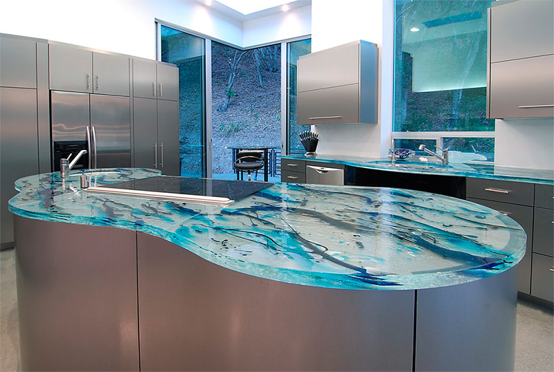
Steel puddle
Stainless steel cabinets are lined up along the walls of this modern kitchen. As a geometric contrast to them is an island table made of the same material in the form of a puddle. The calm calm of this steel miracle is emphasized by a worktop made of art glass. Drops of paint in different shades of blue, it seems, froze inside this "ice". Thanks to the artificially created feeling of coolness, this kitchen looks like the perfect place to relax on a hot summer day.
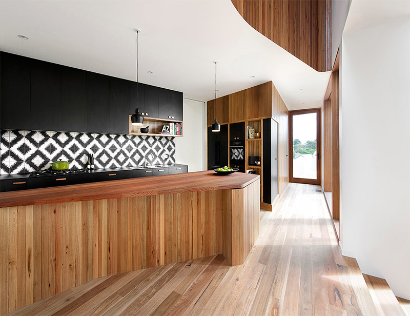
The splendor of wood panels
All the splendor of this kitchen comes from the beautiful multi-ton wooden lining of a large island table. Black matt cabinets that line the back of the kitchen add a touch of modernity to avoid overwork from the look of wood panels. On the apron using black and white tiles, a diamond-shaped pattern is laid out. Black and white colors create a modern version of the accent wall, which draws deeper into a long but narrow space.
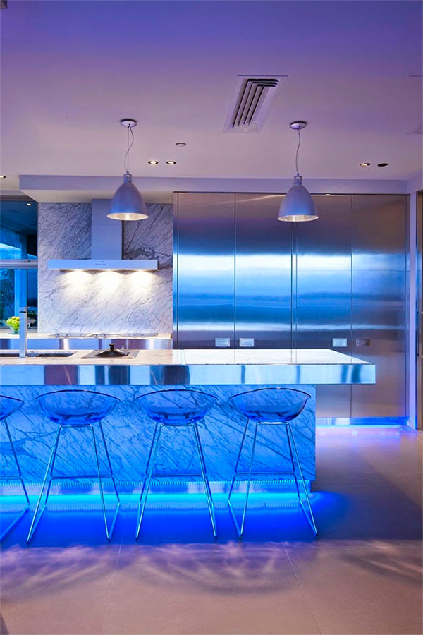
Marble Radioactive Glow
Lighting plays an important role in the design of modern kitchens. It is lighting that can turn the most ordinary kitchen into an amazing one. A clear demonstration of this is the interior presented here. Large floor-to-ceiling stainless steel cabinets cover half the back of the kitchen.
The rest of the wall is allotted to a creamy gray marble apron. The same marble was used to clad the side walls of a large island table. However, the real surprise of this design is the highlight of the front of the island table. Blue LEDs illuminate the kitchen with an eerie but impressive light. For the full effect, the base of the cabinets is also highlighted with the same lamps.
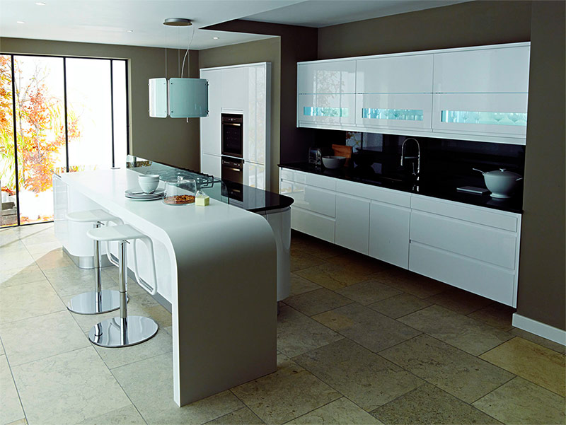
Tone gradation
The gray-brown walls of this kitchen have a special, dark beauty, which seems most expressive against the background of bright white acrylic cabinets. The shiny black countertops contrasted with these cabinets and the taupe walls are an example of a good gradation of tones. The bar with rounded corners is a separate part of the island table; against the background of its rounded shape, modern bar stools are located nearby.
These rounded corners can be traced in various elements of the interior, including in both parts of the island table and in the lamp above it. Natural stone floor tiles, which are very different from the too smooth surfaces everywhere present here, add a textural variety to the kitchen.

