8 amazing Scandinavian-style house interiors
The modern Scandinavian design style, as you know, originated in the middle of the last century. This period of time is marked by a coup aimed at combining form and function in order to create comfortable and affordable living conditions. What are the distinctive features of this style, one of the most popular at the moment?
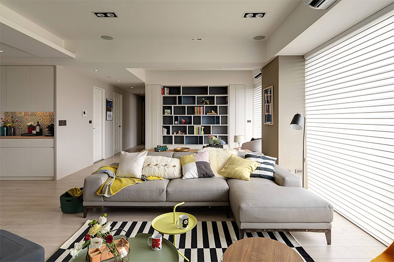
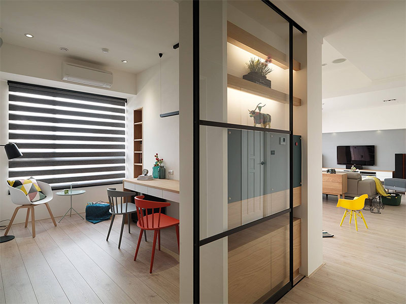
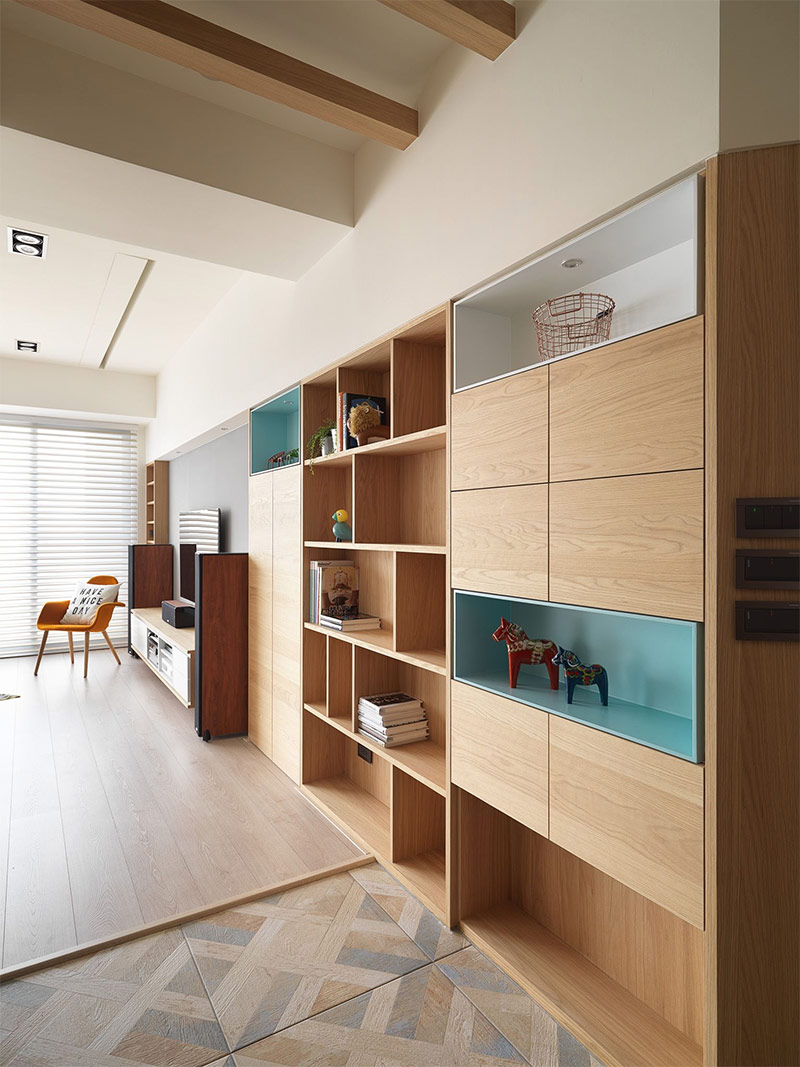
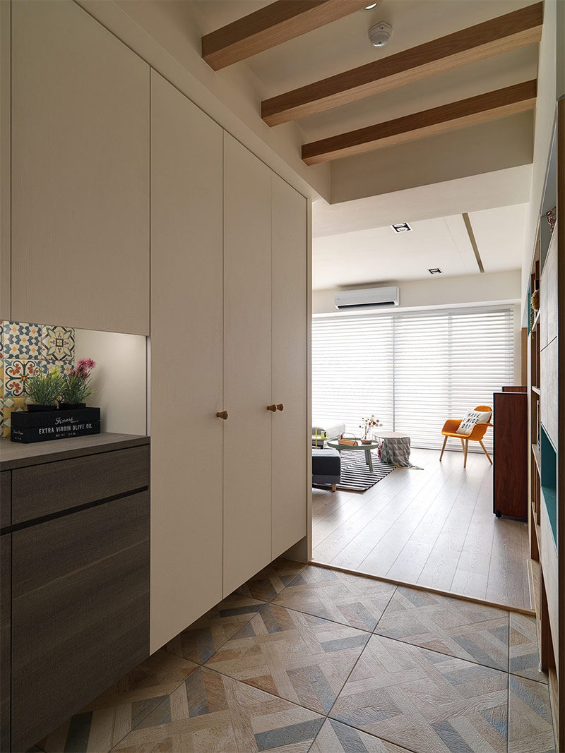
The Scandinavian interior can be bright or muted, minimalistic or very lively and creative. In fact, it includes a wide range of styles, with the most diverse styles. But, most importantly, it is functional and simple. To create an idea of what the interior of the house is in the Scandinavian style, we suggest you take a walk through eight stunningly beautiful houses that embody the basic ideals of this style, but at the same time interpret it differently.
Content:
- Design of house number 1. Bright interior with an open plan.
- Design of house number 2. White interior and many bright colors.
- Design of house number 3. A combination of traditional and modern Scandinavian motifs.
- Design house number 4. Stylish Scandinavian interior with a playful character.
- Design of house number 5. Interior with a calm and relaxing atmosphere.
- Design of house number 6. Scandinavian interior with elements of eclecticism.
- Design of house number 7. Light forms and simple surfaces - a classic of the Scandinavian style.
- Design of house number 8. Scandinavian interior with bright colors and bold patterns.
Design of house number 1. Bright interior with an open plan.
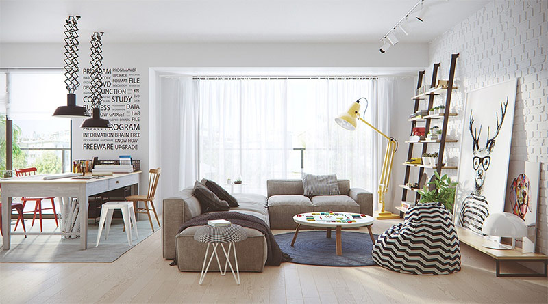
The visualization of the first design project was made by aTng design studio. A bright open-plan dwelling is an ideal place to embody the modern Scandinavian style. This room serves both the living room and the home office.
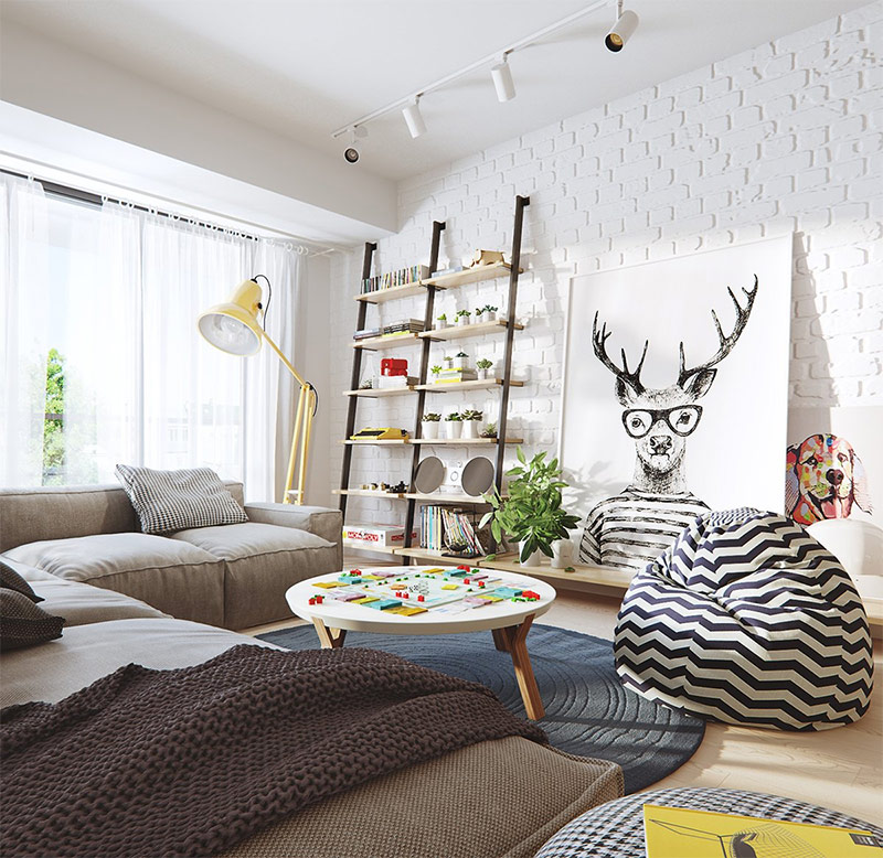
The first thing that catches your eye when you cross the threshold of this room is a dapper deer with big glasses, a sort of hipster from the animal world. This funny picture makes the space less serious. And the yellow lamp will not only amuse, but also create a micro-explosion of color.
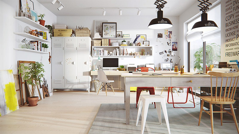
Since this room also serves as a home office, there is everything you need for productive work. White lockers hide important documents from prying eyes and help keep the workplace in order. The paintings along the wall add personality to the home. Living plants both indoors and on the balcony make the room lively.
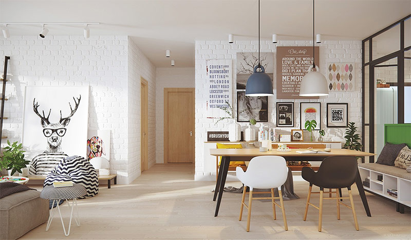
Here you can see the living and dining areas. The designer did not stint, placing art objects on white brick walls. On the left, in the immediate vicinity of the floor, there is a deer, which we already spoke about, and a dog. On the right is a series of images in a graphic style, and they are located higher than the left paintings. This is an interesting use of contrast. The works hung above attract attention to two lamps, the same in shape, but painted in different colors.
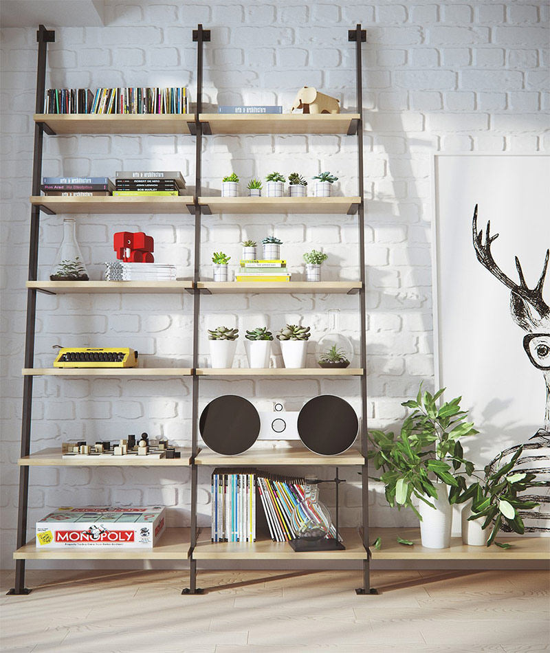
This bookshelf is expertly filled. There is a perfect balance of vibrant greenery, vibrant colors and simple little things. Books are placed on different shelves in different ways. Careless strokes of yellow and green are combined into a single color scheme.
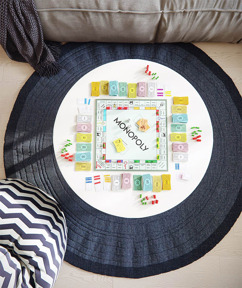
Modern Scandinavian design has always been and remains, on the one hand, very functional, on the other - able to find beauty in the simplest objects. This image of the game "Monopoly" demonstrates the idea that living space is intended primarily for life. Family members can sit around this simple rug and enjoy spending the evening playing!
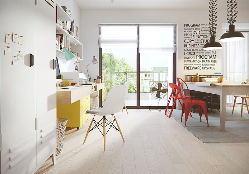
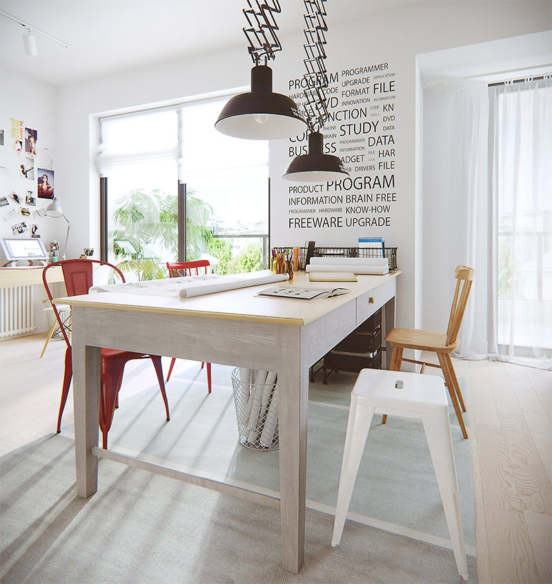
Yellow color helps to renew space. Initially, this home office was decorated in a traditional white Scandinavian style palette, but then interspersed with bright colors, and the room was transformed.Emerald lamp, yellow cabinets and red chairs make the room less flattened, give it extra volume. Green plants on the shelves, as it were, unites the inner space with the balcony outside the window. Is there anything else interesting in this room? Undoubtedly, this is the text written on the wall. The most straightforward text can turn into a work of art if its large black letters stand out against a white wall.
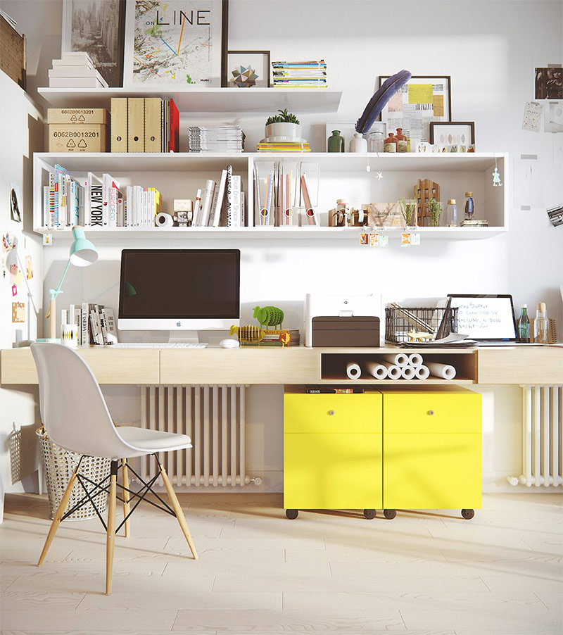
In every home decorated in a modern Scandinavian style, you can usually find an iMac. Why? Apple is based on the same principles as this style of design - simplicity is beautiful and there is no need for excesses. IMac is elegant and luxurious. It fits into the surrounding space (to a large extent this is facilitated by the fact that this computer is decorated in silver or white), but at the same time it stands out from it due to its high prestige.
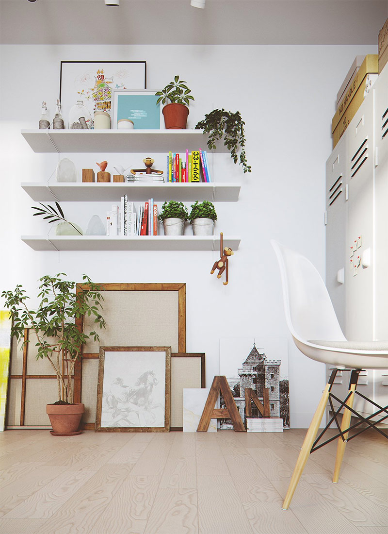
Karina does not have to hang on the walls. In this room, shelves are filled with bright books and cute trinkets that serve as accents. Wooden frames overlapping one another are placed under the shelves. This creates a sense of style. If you add a living object (for example, a houseplant) to the fore, you will get a masterpiece! And all this is due to the versatility of objects and the diversity of their textures.
In this style, breaking the rules is normal. Chairs do not always have to be the same, and paintings do not have to be framed. You may notice that in this work area all the seats are different - there are two red chairs of different styles, one wooden chair and a white stool! Pictures hanging above the computer are not framed and are in some kind of mess. This testifies to the spontaneity of art and serves as an example of how easily it is possible to combine even the most motley collection.
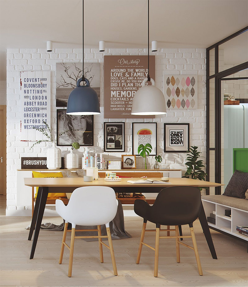
The dining area is open to the rest of the large space of this house. By creating a gallery wall, like the one located behind the dining table, you can cover the entire wall with paintings or only part of it. The designer mixed photographs, wooden tablets and canvases to tell a story he had invented. The lights above this exhibition of works of art enhance the effect created.
Design of house number 2. White interior and many bright colors.
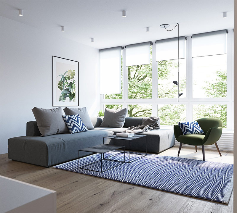
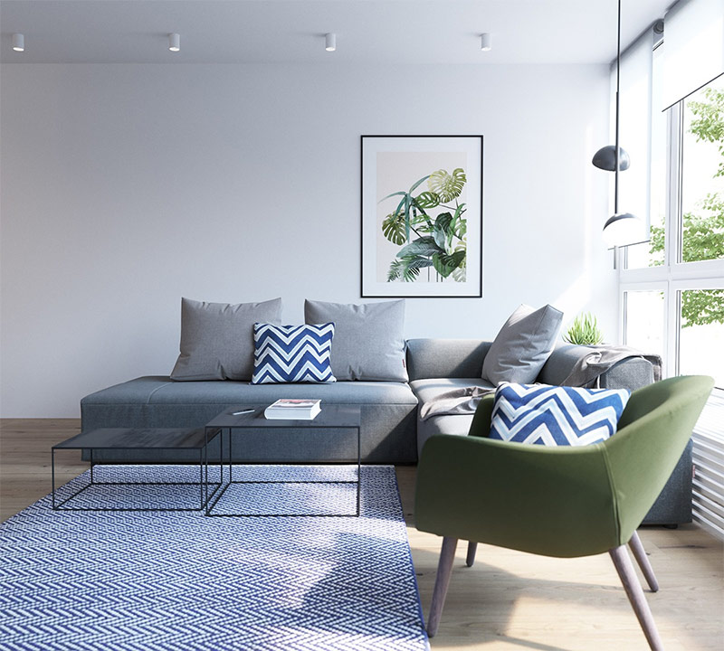
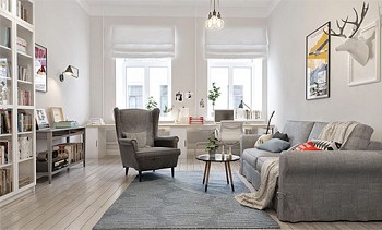
The visualization of the next design project was made by Alexander Vezlomtsev from Line Design Studio. This house is similar to the first, but it does not use so many bright colors. However, the colors that add life to a sterile white room are still here - first of all, it is yellow and green. In this living room, large windows beyond which green trees are discovered are complemented by a picture hanging over a gray sofa.
The greenery outside the window is emphasized not only by the picture on the wall, but also by a natural-green armchair. Blue chevrons on cushions give the room more texture.
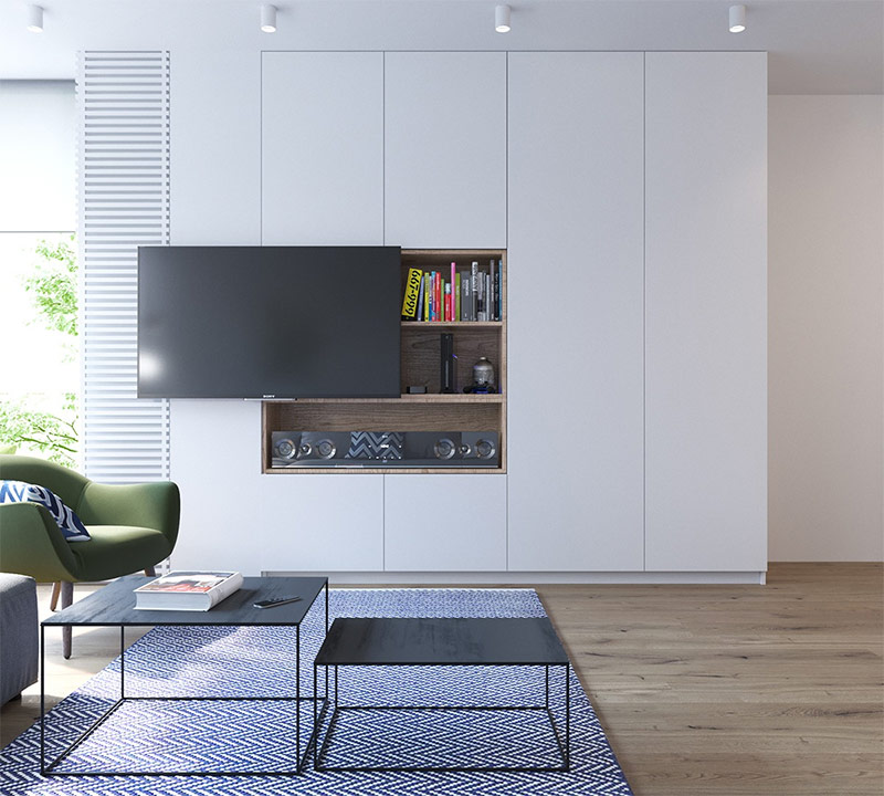
There is a lot of white in this modern aesthetic that lays the foundation for vibrant colors and functional but stylish things. The TV, shifted to the side, provides access to a wooden cabinet with books and various trinkets. Bright roots of books add more color to this seemingly boring wall.
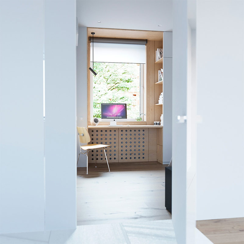
And here it could not do without Apple! There are fewer colors in this study than in the first; it is simpler and more concise. A large window allows you to get a little distracted from work and focus on what is outside, the trees behind the glass give the room an element of naturalness.
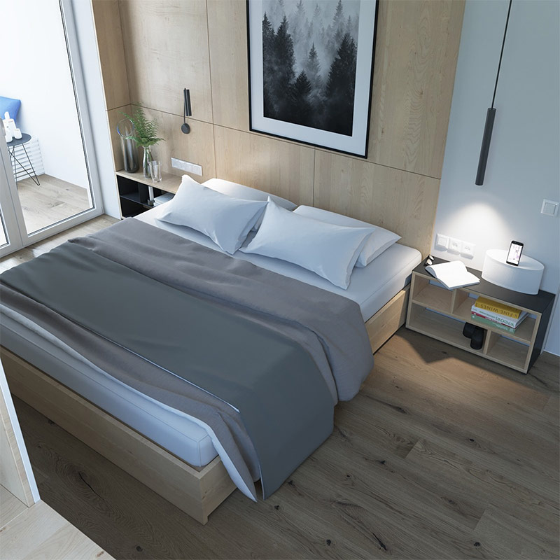
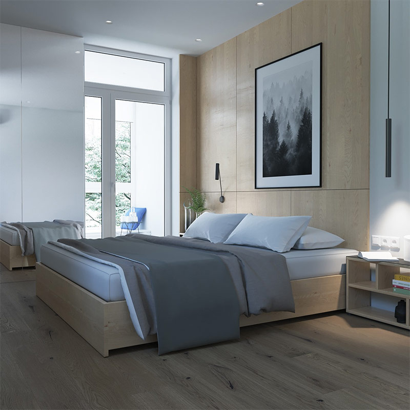
The bedroom in a modern Scandinavian house should be as simple as possible, since it serves exclusively for recharging. A minimum of excess! Only one picture is hung over the bed. Every emphasis - from the image of trees in the photo to the leaves of ferns on the bedside table - takes you outside the house.
Exterior elements play a special role in the design of the whole house. In addition to the photograph, which beckons to slip away from the house, is a balcony. The furniture standing on the balcony indicates that the owners spend a lot of time there.
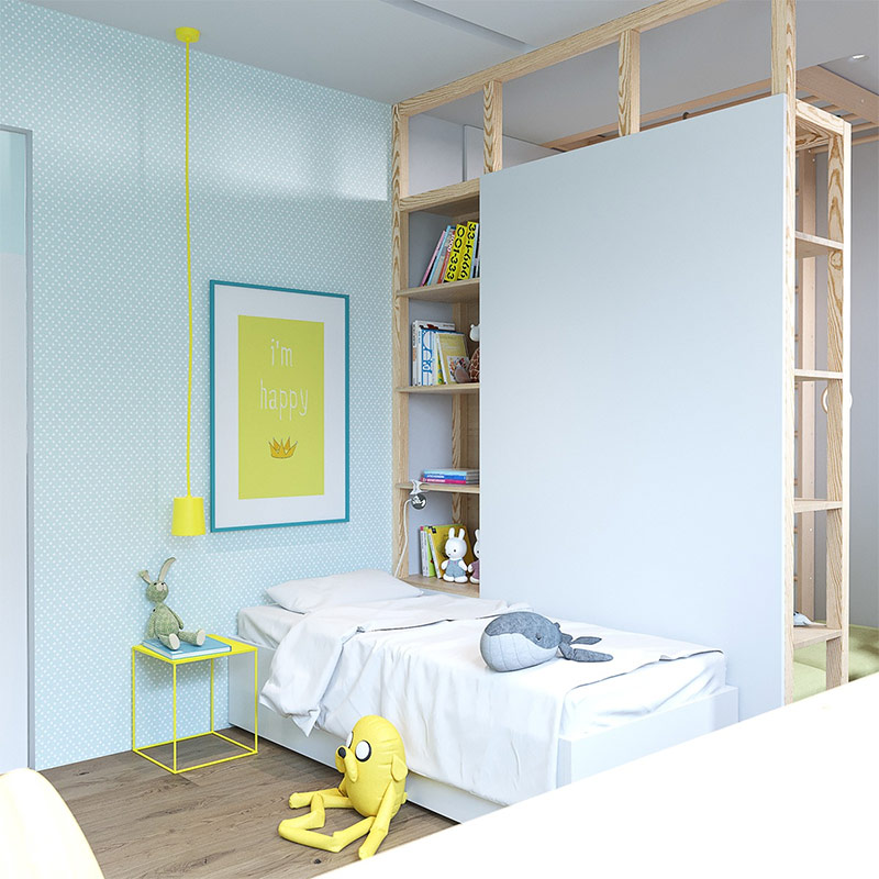
The children's room is the same style as the rest of the house, but it uses bright yellow shades to bring joyful mood and playfulness into the space. The bed remains simple, large bookshelves filled with children's things. The yellow bedside table goes well with a poster hanging nearby.
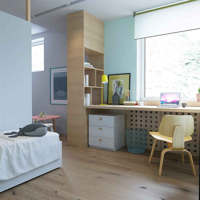
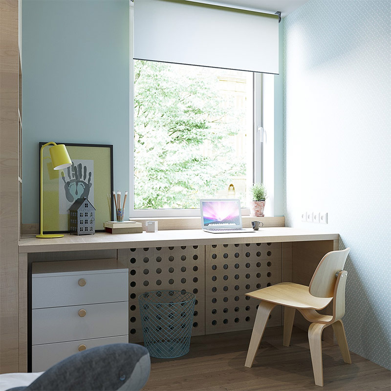
The designer preferred the usual desk to the built-in, stationary placed along the entire length of the room. This table is ideal for a child, and the adjacent windows ensure good lighting during work.
There is not much yellow in this part of the children's room, but here you can also find it - in the picture placed on the table and in the lamp standing next to it. The rest of the homework area remains simple and natural.
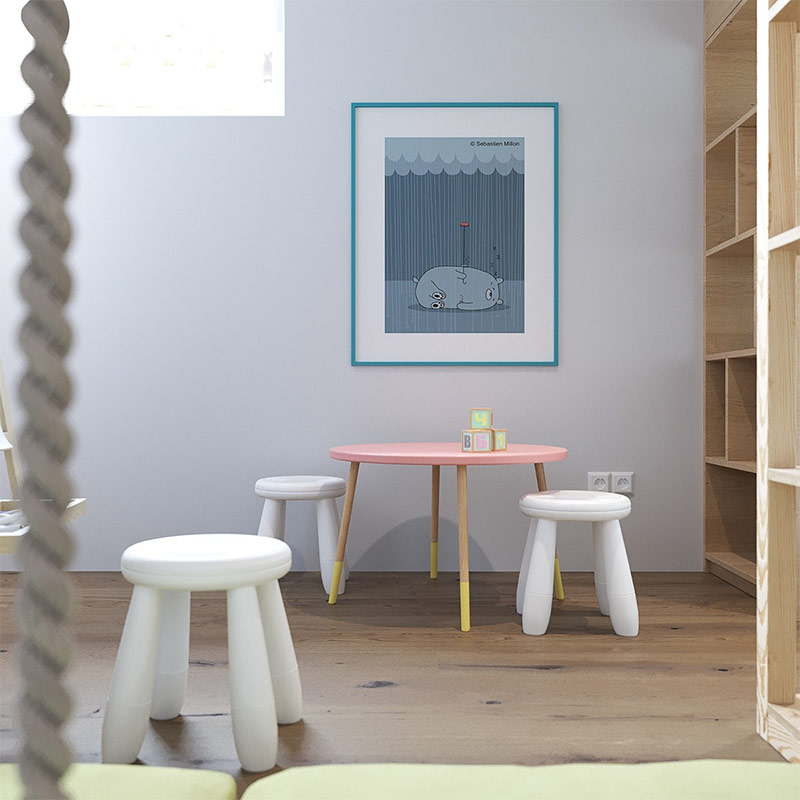
The play area has small stools and a very large picture on the wall. The latter makes it clear that the space is intended for the child, and gives the room more color. There is enough free space on the built-in shelves to hide toys.
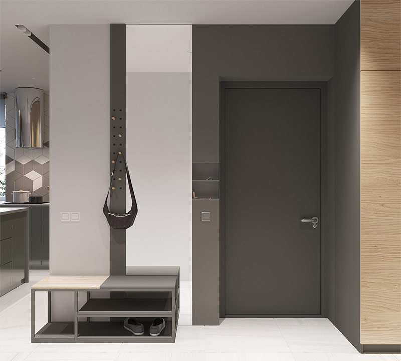
The entrance hall, decorated in gray tones, is associated with the industrial and industrial premises. The amount of furniture here is minimized: there is a bench on which you can sit, a hanging hanger for outerwear and bags, as well as a built-in shelf for keys and other little things that you may need when you leave the house.
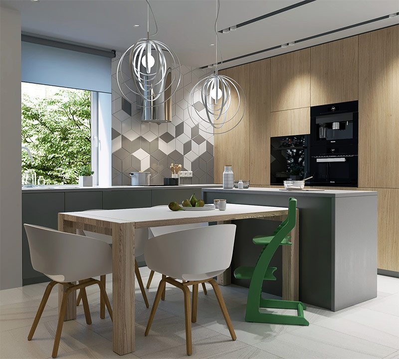
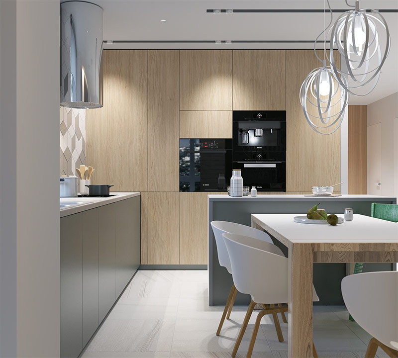
There is nothing excessive in the kitchen, so it is good. Above the dining table are round lamps of an unusual shape. The green highchair serves as an indication that not only adults, but also the baby are having lunch at this table. The geometric ornament created with the help of tiles makes the room even more interesting. A large window invites green trees into this cozy room.
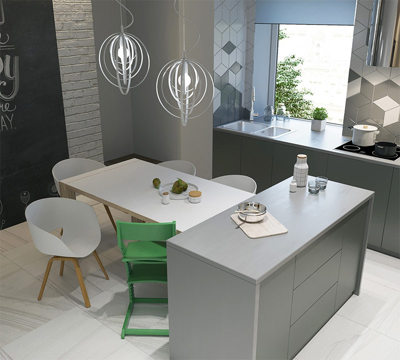
Looking at the table and the surrounding space from above, you can see how contrasting the high green chair looks compared to other interior elements. On the left is a black wall on which you can draw with chalk!
Thanks to tall cabinets, the kitchen looks much bigger than it really is. Kitchen appliances are built-in, which also saves space.
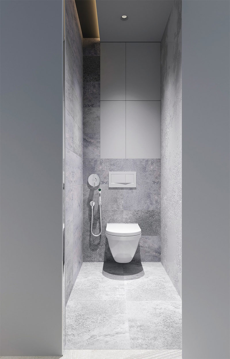
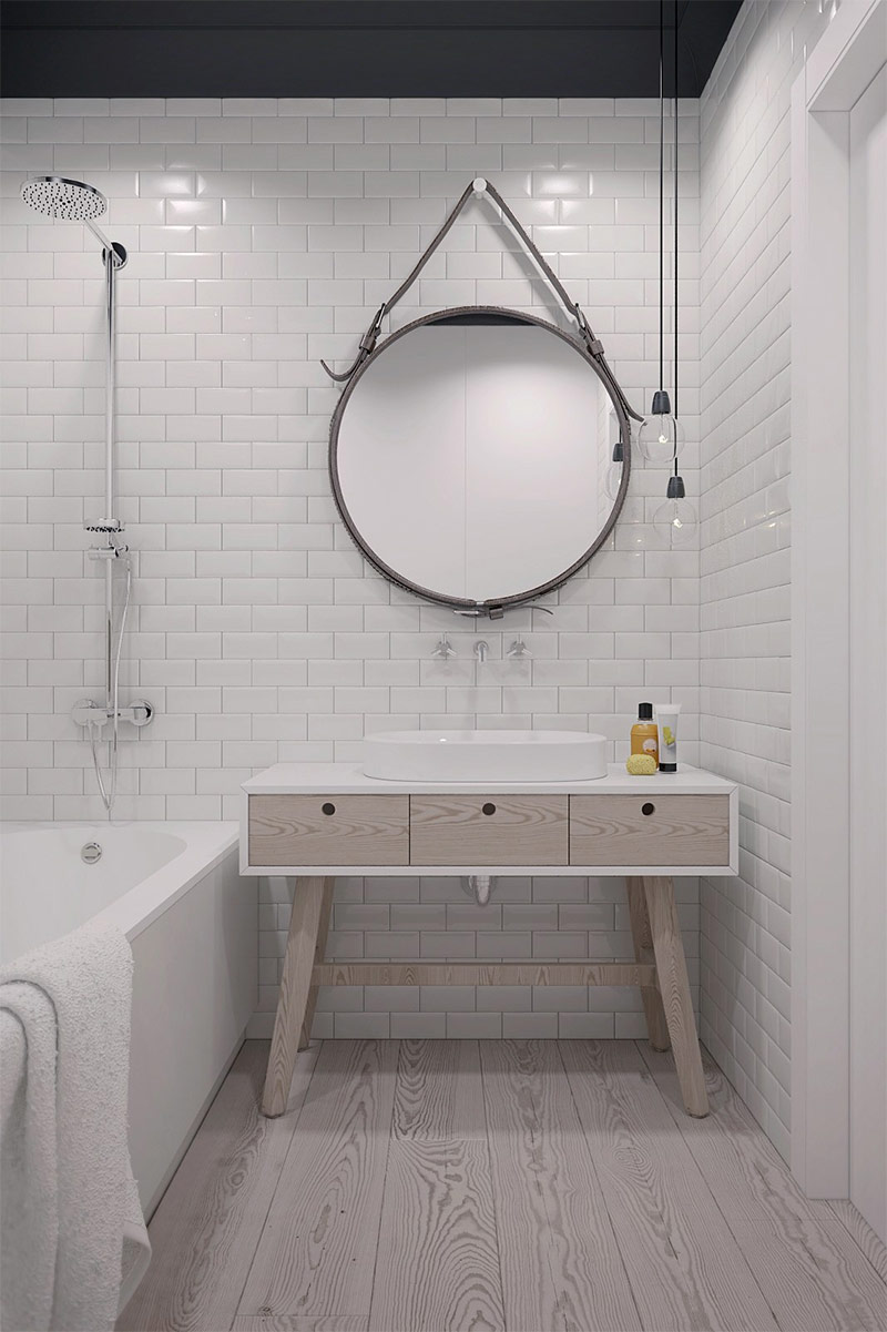
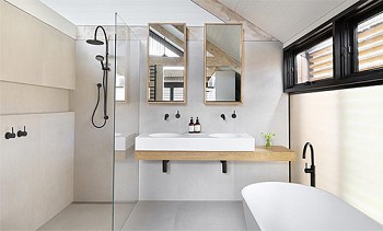
The bathroom in this house is also made in a modern style. There is no need to add stylish accessories - the room is as simple as possible, because it is designed to perform its strictly defined functions, which means that there should be nothing superfluous here.
Design of house number 3. A combination of traditional and modern Scandinavian motifs.
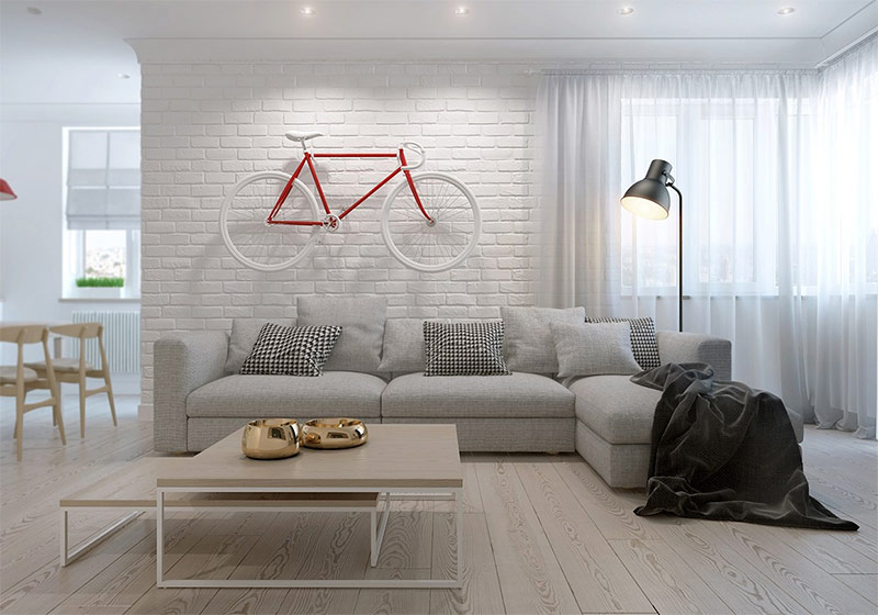
The design of this bright and airy house, designed by Konstantin Kashchuk, includes a variety of traditional Scandinavian themes, but a contemporary influence is also felt here. For example, light parquet floors are a return to the classic Scandinavian style, while the streamlined shape of the furniture is a product of modern trends. Are you surprised by the bike hanging over the sofa? Familiarity with the quirky and playful decor is yet to come.
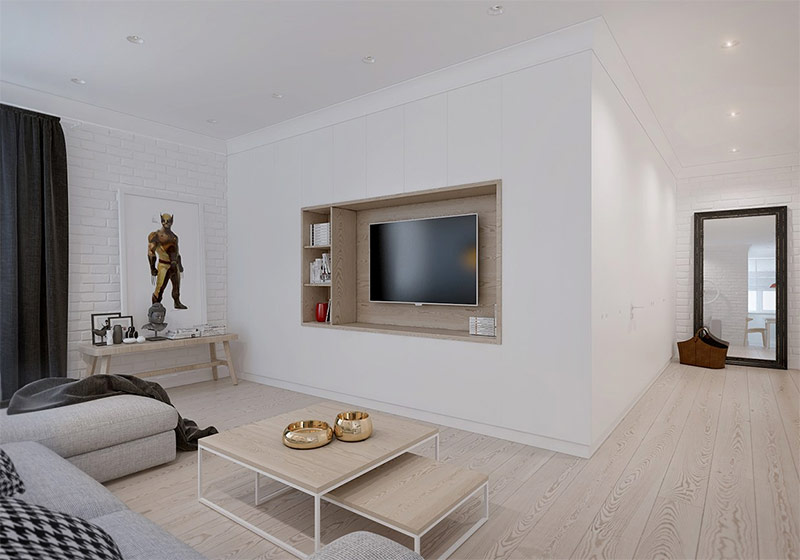
The main attraction of the living room is a TV recessed into the wall in a frame of the same tree that is used on the floor.
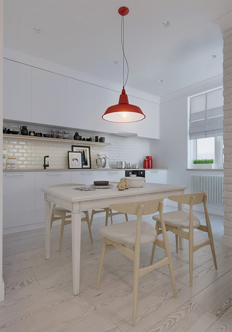
Red accents bring visual energy to the kitchen. The iconic CH33 chairs by Hans Wegner are one of Danish design's most famous products. Here they serve to bridge the gap between the natural tones of wood used in this space.
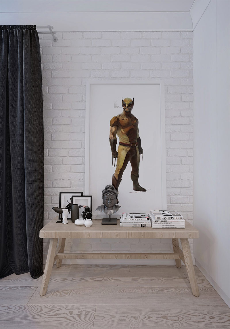
A picture of Wolverine's superhero in the pop art style joins a collection of sculptures and ceramics on a small table hidden in a corner.
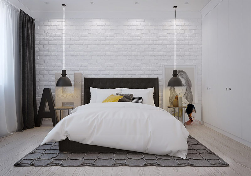
The artistic theme of the bedroom is based on portraits located on the floor and huge letters made of wood. The soft carpet under the bed allows you to keep your feet warm when you get out of bed in the morning.
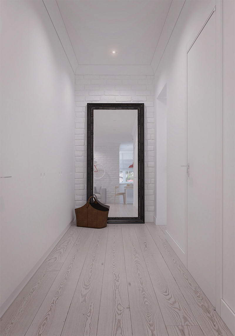
Warm wood and bright white tones of the walls and ceiling themselves serve as decoration - additional accessories are no longer required here.
Design house number 4. Stylish Scandinavian interior with a playful character.
Without a doubt, you will fall in love with this house at first sight! All of us (or almost all) somewhere deep down are still children, and designer Anton Medvedev knows how to please this inner child, how to please him. That is why he filled the space of this house with elements of a playful character, which, however, remain at the same time stylish and highly artistic. Scandinavian decor often looks like a breath of fresh air, thanks to its young energy and uncompromising honesty. And this modern interior is a good example.
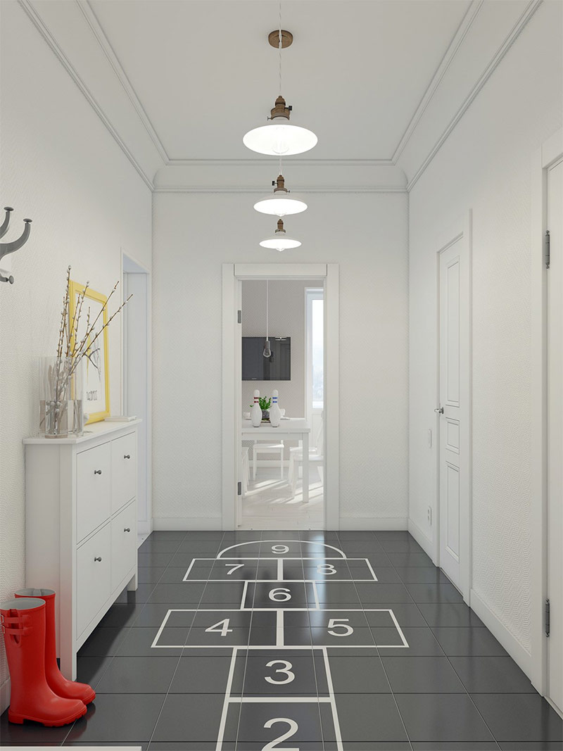
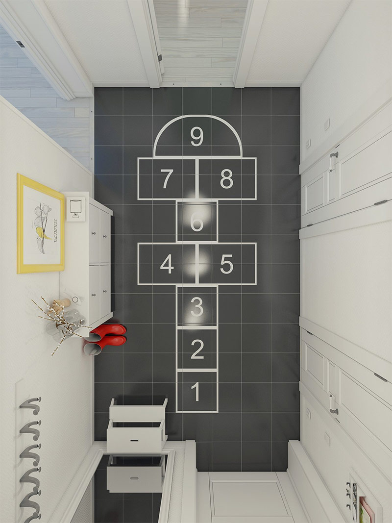
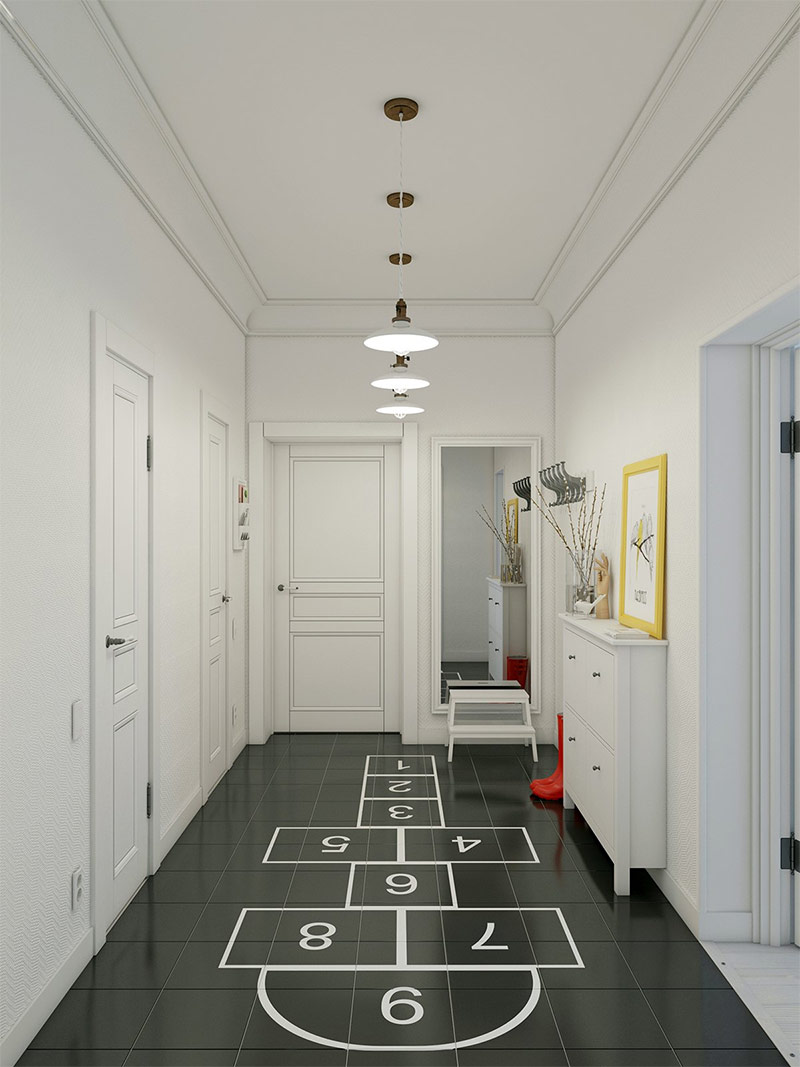
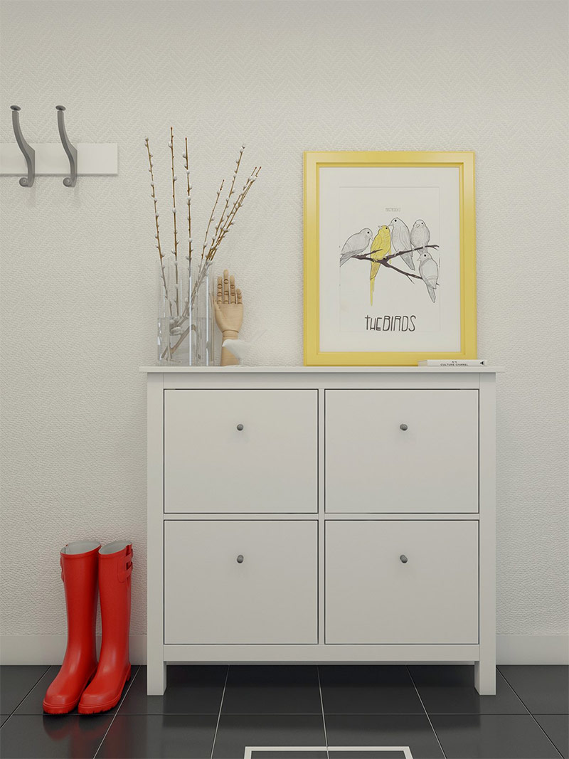
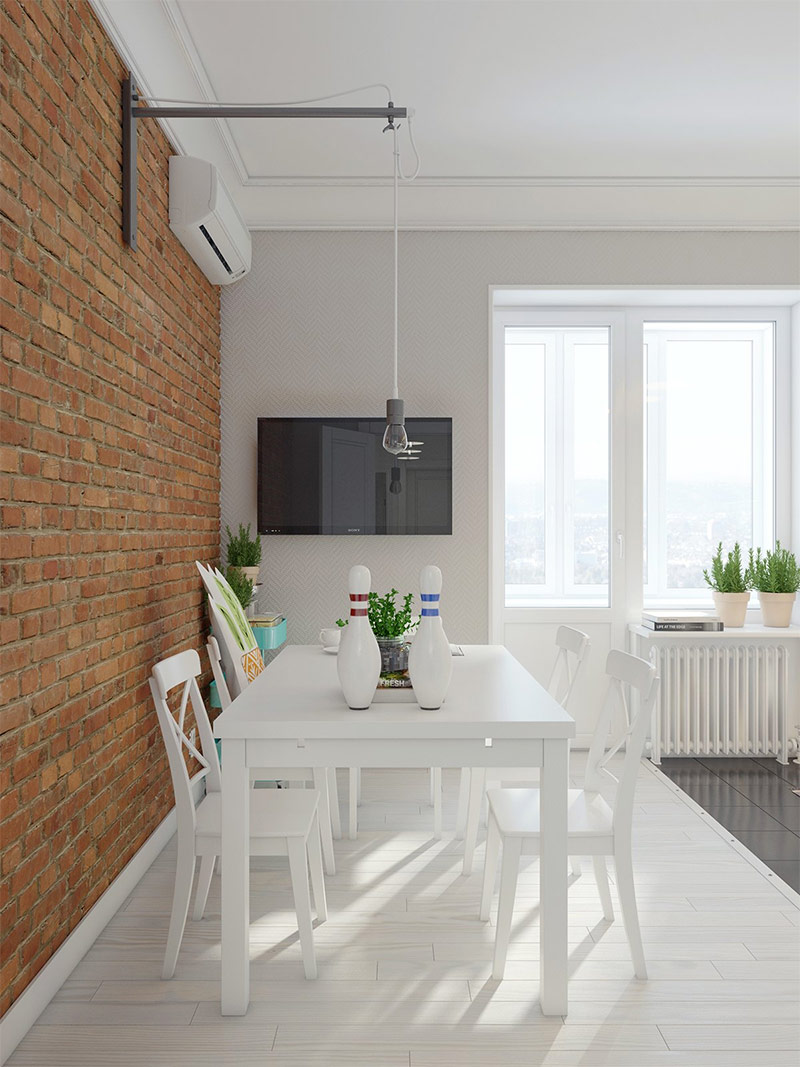
As soon as you cross the threshold of this house, you will see the good old "classics" who welcome visitors with their charming simplicity. Well, who can resist here?
If the Scandinavian style in the interior of a country house is exactly what you are looking for and what you are striving for, remember that the main thing is to make a first impression. And the designer, no doubt, succeeded ...
Charming yet functional accessories make you feel at home here.
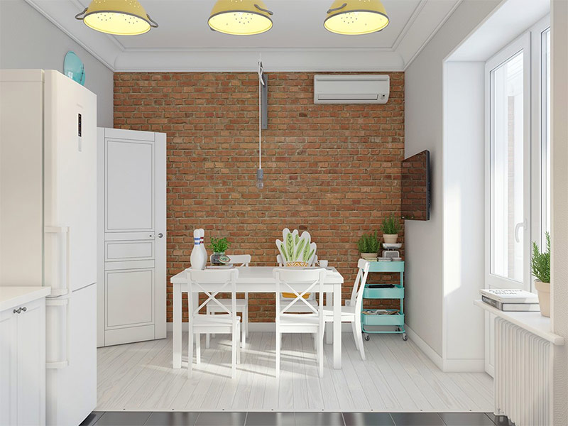
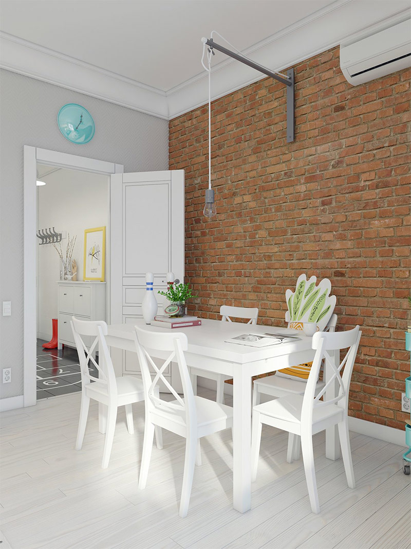
A dark brick wall and a snow-white floor seem to turn the living room space 90 degrees.
A small pillow in the shape of a houseplant and pins on the table seem eclectic at first glance, but they are a great way to show the interests of the owners in a unique and inspiring form.
Pay attention to the textured wallpaper on the far wall - subtle, but stylish!
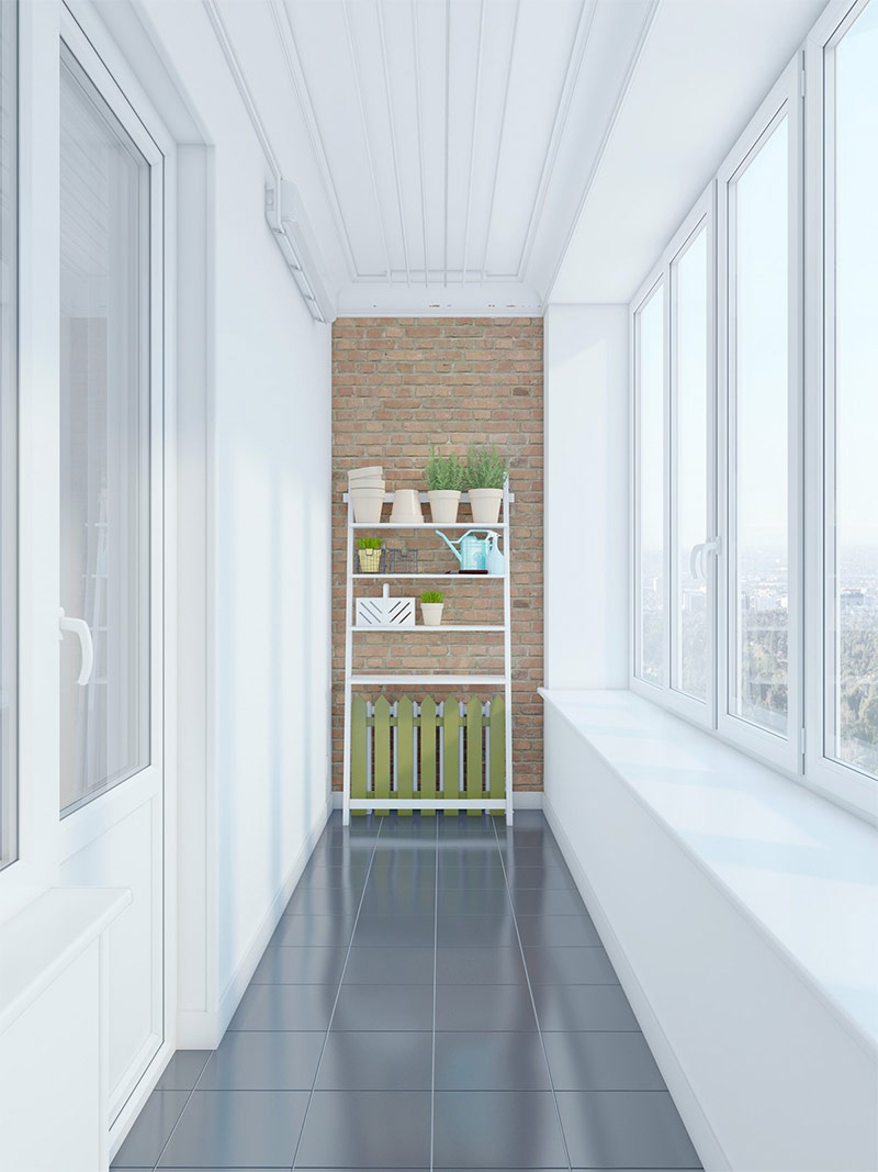
Of course, this garden on the balcony is an absolute perfection. What is only a cute decorative fence.
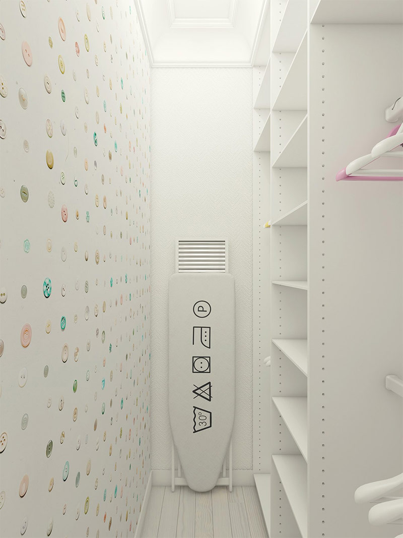
Wallpaper with the image of multi-colored buttons and a “smart” ironing board prepare to get acquainted with an amazing wardrobe room. Most likely, she will look just as good, being filled with bright clothes.
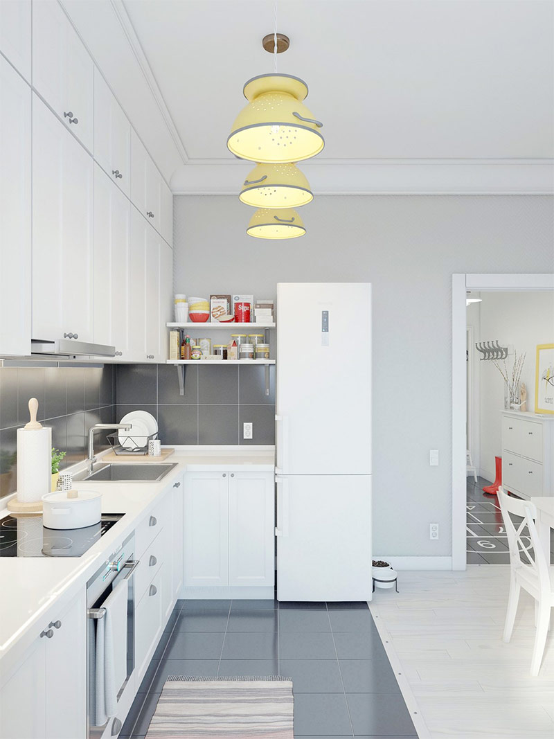
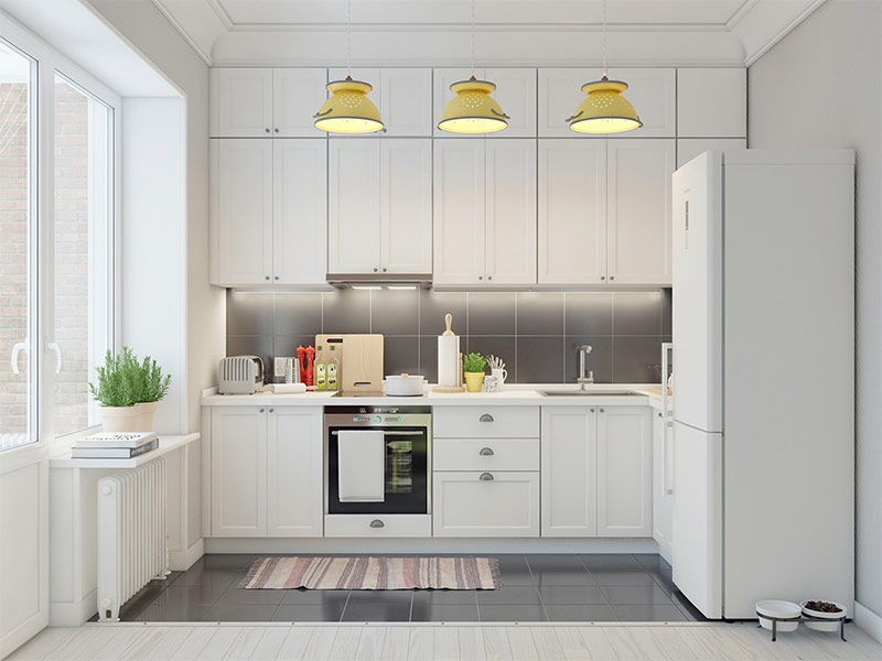
Pastel yellow colanders got a second life in the form of pendant lights in this magnificent white kitchen. You can realize this interesting idea at home.
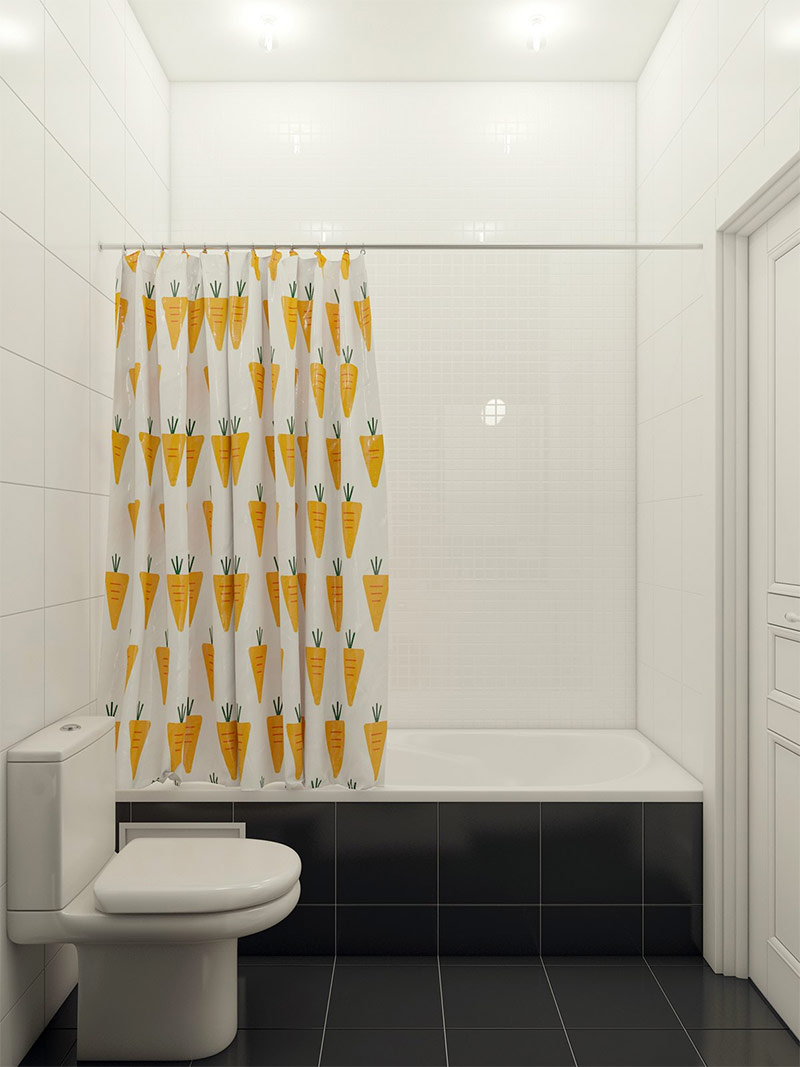
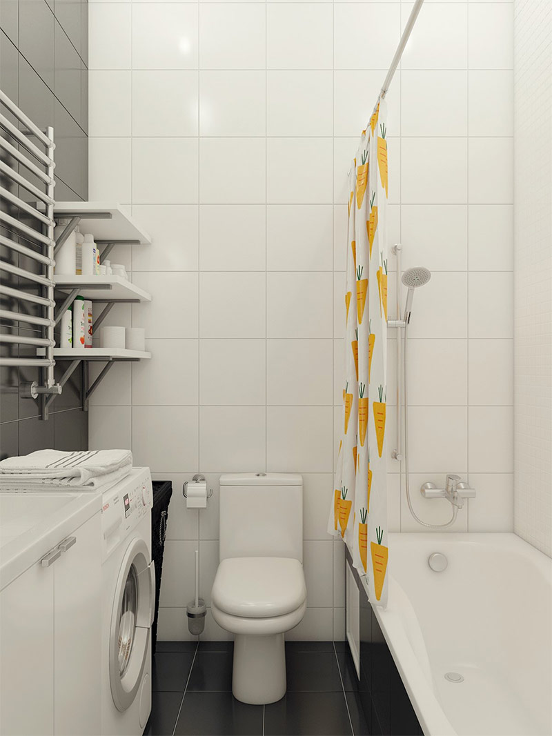
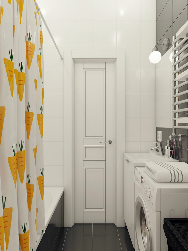
Black and white tiles will give the bathroom a simple and serious look, but shower curtains with the image of a charming carrot will give individuality and plenty of joy.
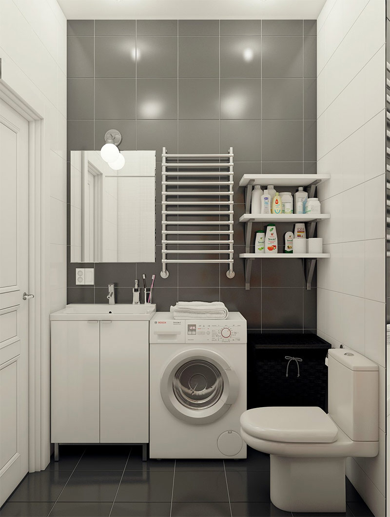
Minimalistic tiles are a great choice. With an abundance of decor, the room will look too cramped and cluttered.
What an effective use of space! Not a centimeter for nothing.
Design of house number 5. Interior with a calm and relaxing atmosphere.
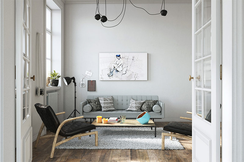
Interior designer Zinaida Baklanova, while still a child, lived for several years in Sweden and gained invaluable experience there, which was useful to her in her professional career. She realized that the goal of the designer was not to imitate a particular style, but to capture his general atmosphere and personality. Everything in this living room, from the arrangement of objects to the color scheme, was chosen by her in order to create a calm and relaxing atmosphere for the owners of the house who want to chat and relax at the end of a difficult day.
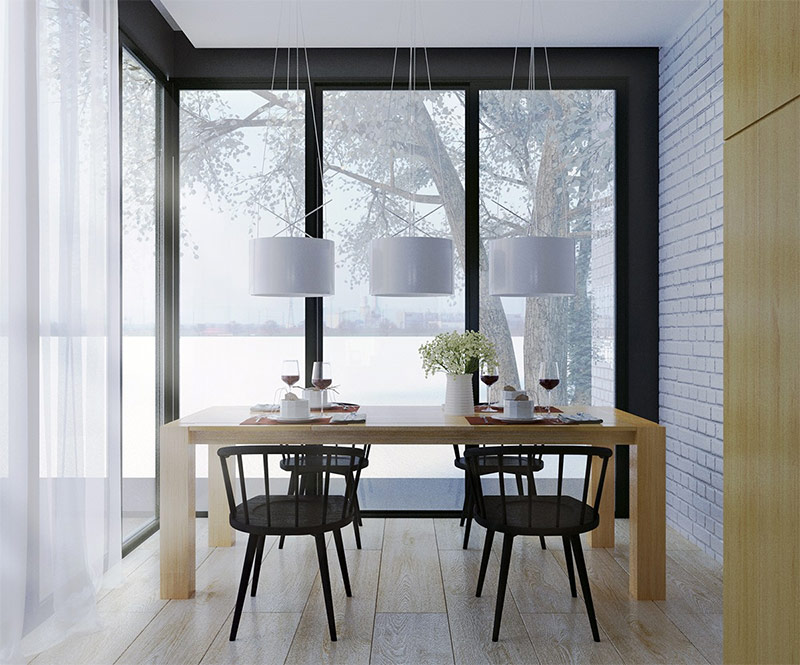
The dining area is incredibly bright and spacious, despite the fact that it occupies a small space. Very wide floorboards and thick table legs create a sense of scale.
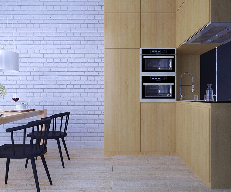
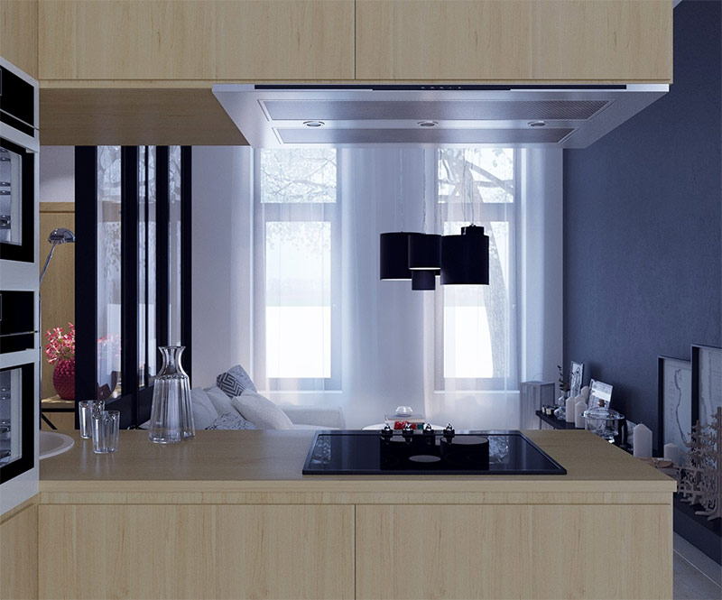
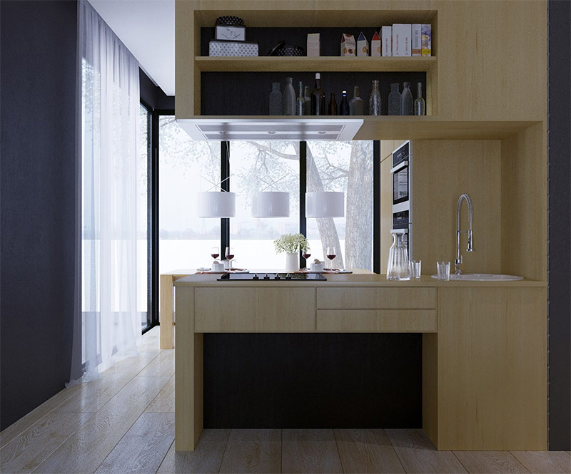
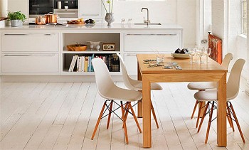
The compact kitchen serving as the center of the house is located between a very bright dining room and a somewhat gloomy living room. Warm natural wood contrasts perfectly with the bluish tones that are present in all other parts of the house.
Against the background of the kitchen island, two tall narrow windows that are curtained with thin translucent fabric look great, which creates a feeling of unearthly lighting.
Design of house number 6. Scandinavian interior with elements of eclecticism.
The French designer Aurélien Brion used a particularly interesting approach to Scandinavian-style interior design, resulting in an elegant and perky welcoming house at the same time. In terms of decor, this home looks eclectic - a variety of colors and styles is a reflection of the diversity of tastes and interests of the owner of the house. Those who want to transform their own houses and apartments can endlessly draw inspiration from looking at this interior with a touch of Scandinavian charm.
There are so many fun little things!
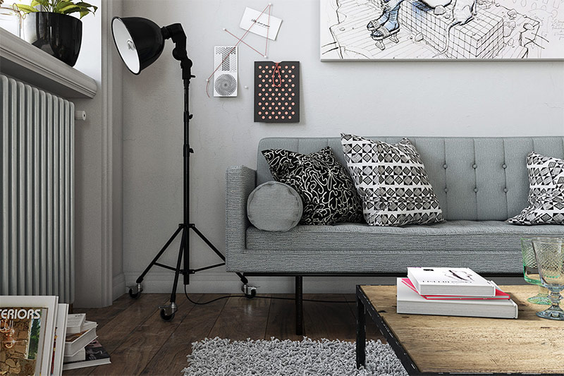
A photographic spotlight, fabric on pillows with a nice print, as well as a variety of works of modern art - there is something to look at.
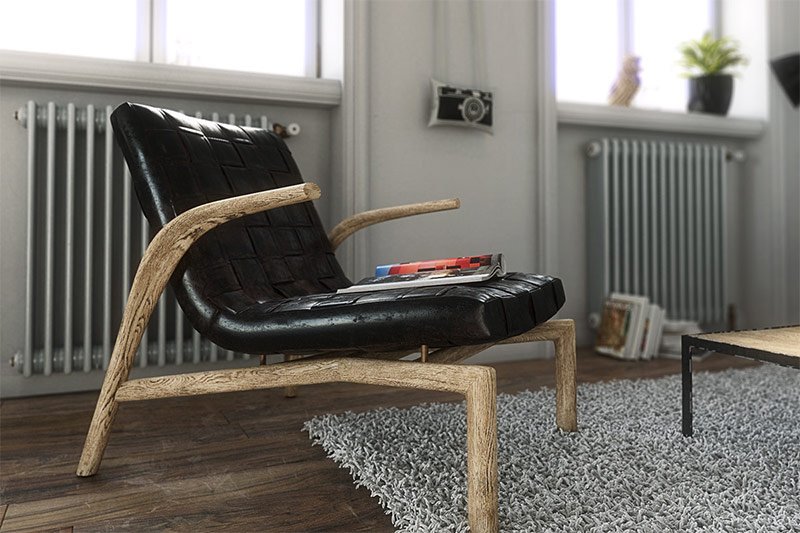
The battered flooring and natural looking armchairs give the room an organic personality.
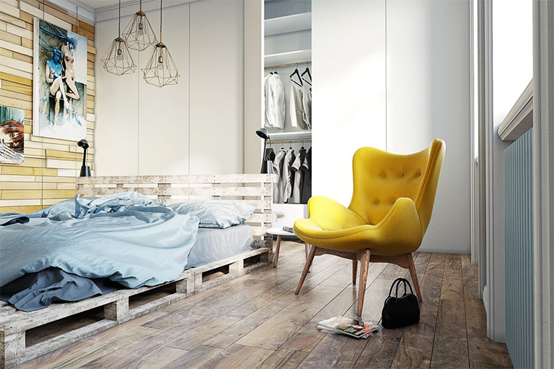
The bedroom is especially concise! The bed frame is made of old pallets (stability is another hallmark of modern Scandinavian design). The bright yellow chair was clearly created not for the Scandinavian interior, but it fit perfectly into the general aesthetics of the space.
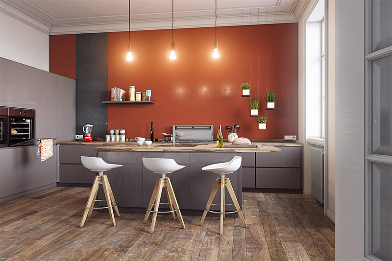
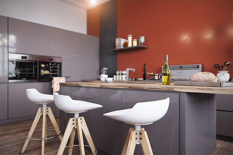
The rusty orange color in the kitchen creates a big splash of passion, and against this background this delightful hanging garden looks strikingly contrasted.
Design of house number 7. Light forms and simple surfaces - a classic of the Scandinavian style.
This beautiful interior with its simple forms, light surfaces, light negligence and at the same time remaining consistent remains true to the foundations of the Scandinavian style. But at the same time, he challenges many of the patterns that can be found in feature magazines. This interior refuses minimalism in favor of an interesting ornament and bright colors - in fact, it is a more realistic reflection of everyday decor in the north. As a result, you will truly feel at home here.
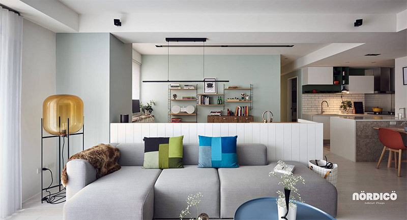
Almost all colors of the rainbow are used in interior decoration. In countries with a cold climate, where the Scandinavian style originated, these cheerful colors help to survive long and dark winters.
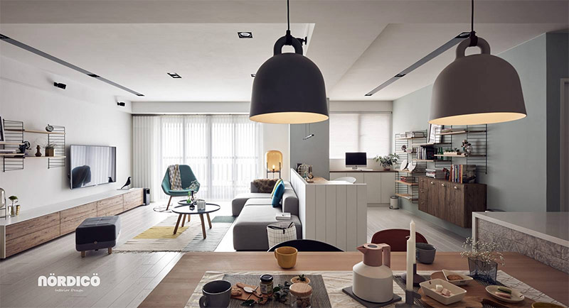
An open layout allows sunlight to penetrate the farthest corners of space. In addition, thanks to her, the owners of the house will not be able to leave their guests even at those moments when they will be forced to do urgent tasks - look after the children or finish the urgent work in their home office.
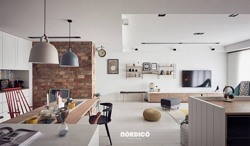
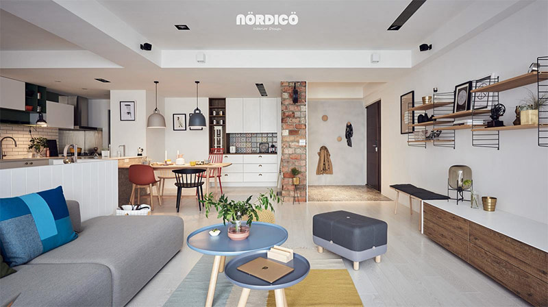
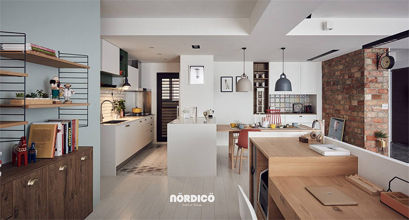
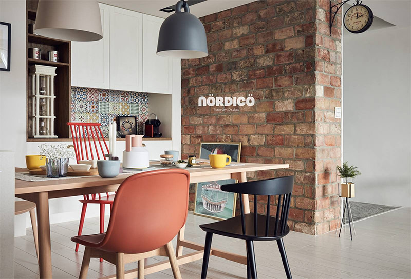
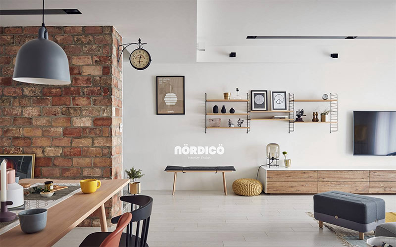
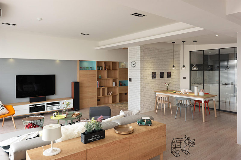
This solid brick wall provides visual warmth and helps separate the hallway from the living room. A double-sided clock, like the one used before at railway stations, allows you to find out the time, regardless of whether you are in the living room or have just entered the house / are going to leave it.
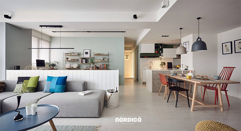
In the interior design of the room used exclusively bright colors. The dominant color of the living room is blue, red prevails in the dining area.
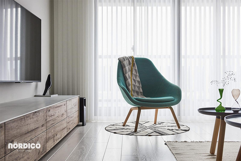
This beautiful emerald chair is the work of designer Hee Welling from his Lounge series.
Tiles of an unusual geometric shape draw attention to the kitchen floor - this element is often overlooked in open-plan houses.
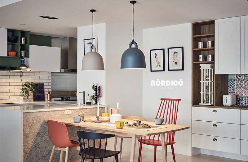
Eclectic chairs always make the dining room look fun and carefree. The collection assembled in this dining room includes a variety of chairs - from classic to modern, including the work of Danish designers Paul M. Volther (Poul M. Volther) and Jorgen Baekmark (Jorgen Baekmark) and British designer Sebastian Wrong (Sebastian Wrong).
Huge pendant lights are certainly the epitome of functionality associated with Scandinavian design. They are from the Bell Lamp collection by Danish designers Andreas Lund and Jacob Rudbeck ..
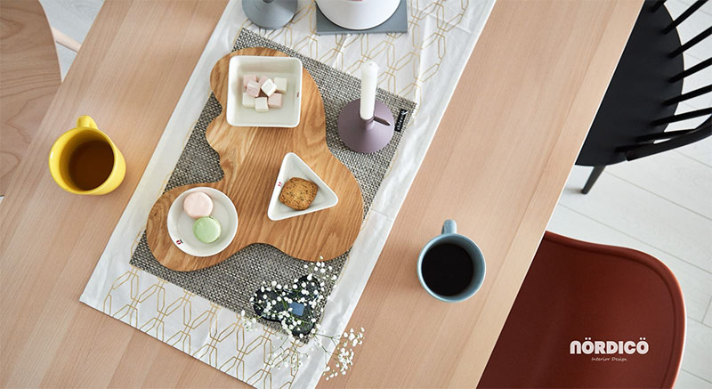
Don't you like this unusual tray? It imitates the characteristic curves of the legendary Savoy vase of the famous Finnish architect Alvar Aalto.
The drawing on the wall is also associated with the name of Alvar Aalto. This is a minimalist image of the popular bee hive lamp he created.
Not far from the entrance is a sooty Oda table lamp by Sebastian Herkner.
There is a bench, which will be very useful when you need to take off your shoes upon returning home after a hard day at work.
This home office overlooking the living room makes work extremely comfortable.
Numerous shelves and cabinets for storage contain all the reference materials that may be needed in the work.
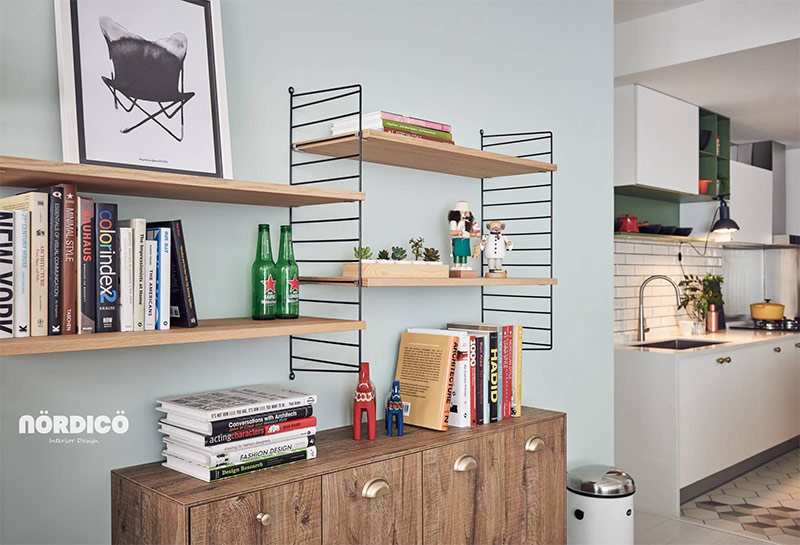
Dalecarlian horses (or Dala horses) are known around the world as one of the most beloved and popular Swedish handicrafts. Such toys first appeared in the province of Dalarna and quickly turned into a handicraft item.This industry has its own rich traditions, which vary by region.
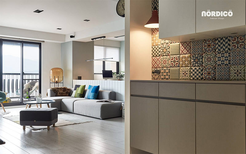
Near the front door you can see an eclectic tile with rich colors and playful decor.
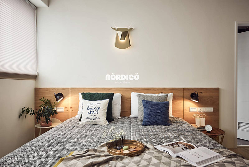
This cozy bedroom is striking thanks to the rich variety of colors and textures of pillows lying at the wooden headboard. Blue, green and yellow accents continue the palette that began in the living room.
At the foot of the bed you will find the simplest things, and not a TV at all, as is common today in many houses. But this is not at all boring - for example, we really liked this decorative niche with lighting and the birdcage inside.
Creative artificial taxidermy offers a great alternative to the trophies found in northern hunting lodges.
Before you is the second bedroom of this house. All typography items fit perfectly into modern Scandinavian interiors. Words naturally attract attention.
Design of house number 8. Scandinavian interior with bright colors and bold patterns.
While the previous house cultivated a laid-back aesthetics, a more adventurous approach with bright colors and bold patterns is observed in this interior. White walls are the hallmark of Scandinavian design, but they play a particularly important role in this house. If the wall surfaces were painted in any other colors, they would distract attention from the magnificent furniture and textiles that define all the functional areas. The space between the zones remains free, open, uncluttered, i.e. absolutely in line with the ideals of the Scandinavian style.
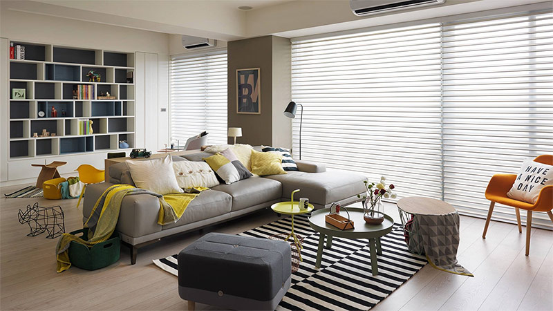
The room's palette resembles the colorful rows of houses found in coastal northern cities. There, these bright colors allow you to fill the life of the dark northern winter, they seem to have to attract summer, the sun and wildflowers.
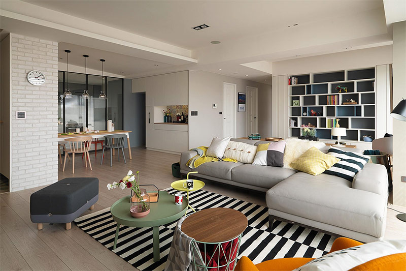
Almost all the furniture in the living room seems very soft due to the rounded edges. In general, smooth bends are very characteristic of Scandinavian furniture, especially since 1960-70, i.e. from the era called Mid-Century Modern.
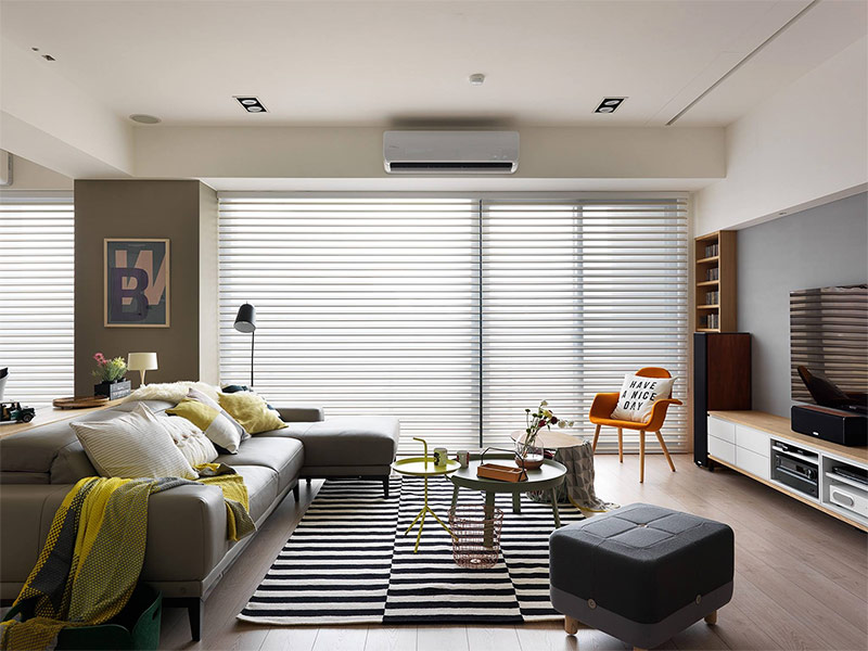
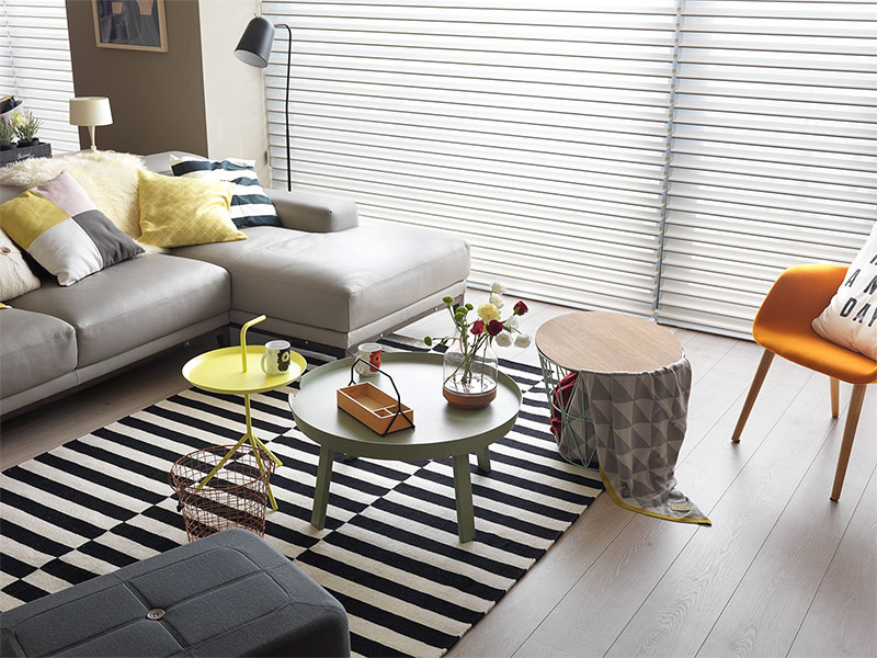
However, in general, the interior of this Scandinavian-style house looks very modern. This is facilitated by the contrast between furniture with flowing shapes and linear elements such as carpet, shelves, and blinds.
Danish designer Thomas Bentzen worked on the creation of both coffee tables. Yellow is from his Don’t Leave Me series, and the green table is called Around. A super-useful combination of a wastebasket and a coffee table - from the Scandinavian design brand Ferm Living.
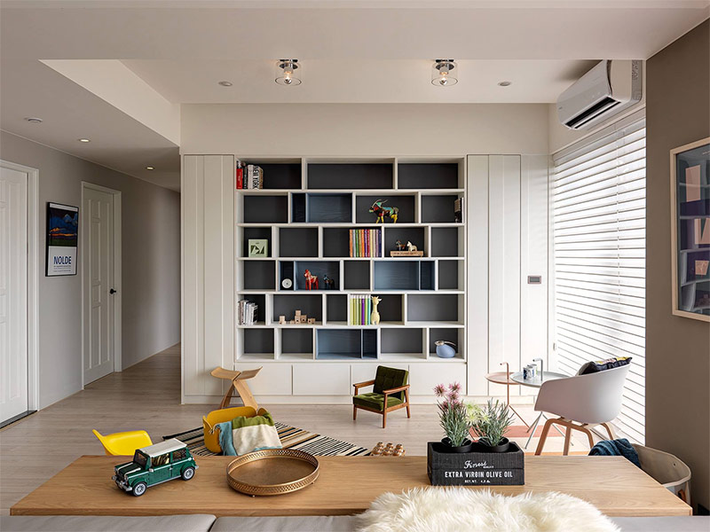
Built-in shelves at the front door are designed to store decorative gizmos. The long chest of drawers, which took up unused space behind the sofa, serves the same purpose.
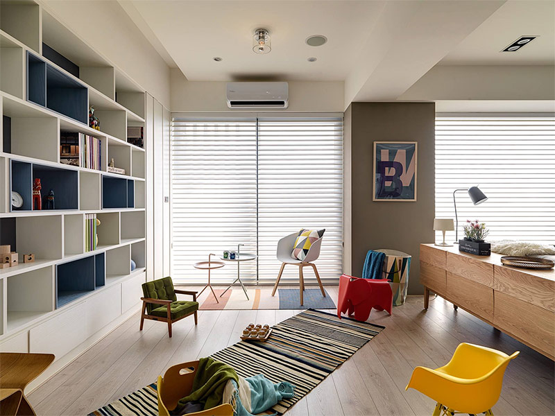
This children's area is incredibly charming! Little family members got their own tiny living room for their use, and miniature versions of the famous designer chairs will make the kids stay here as comfortable as possible.
Thanks to a variety of partitions, using a bookshelf has become even more convenient. Children can take out their favorite books and enjoy reading or play with the colorful Dala horses.
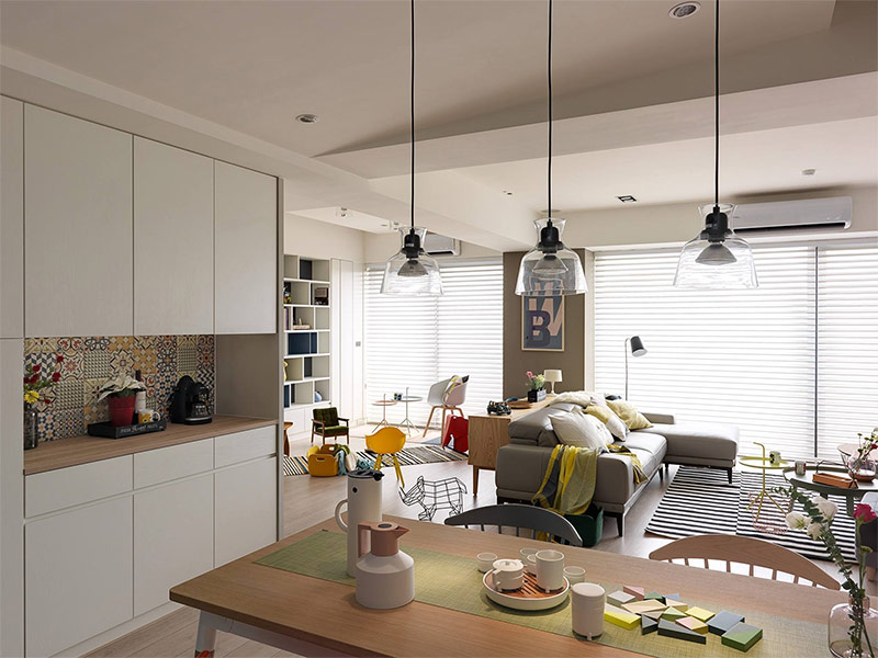
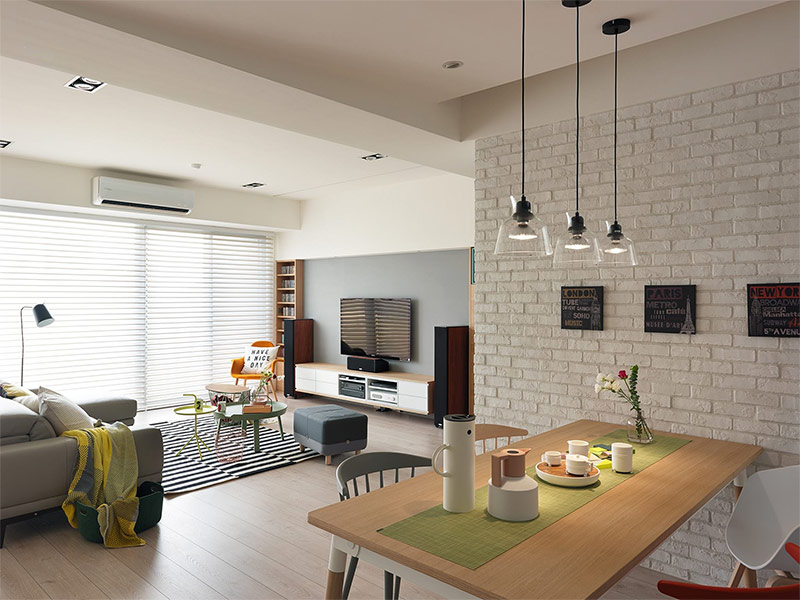
The small kitchen and dining room got the darkest and most secluded part of the open-plan living room - here no one will bother you to cook dinner or enjoy a cup of tea with dessert.
The kitchen apron is decorated with an eclectic tile combining the pastel color palette of the dining room with the bright colors of the living room.
When arranging the dining area, you need to remember about the proper organization of lighting. Three pendant lamps weigh immediately above this dining table, so that the entire surface of the countertop is well lit.
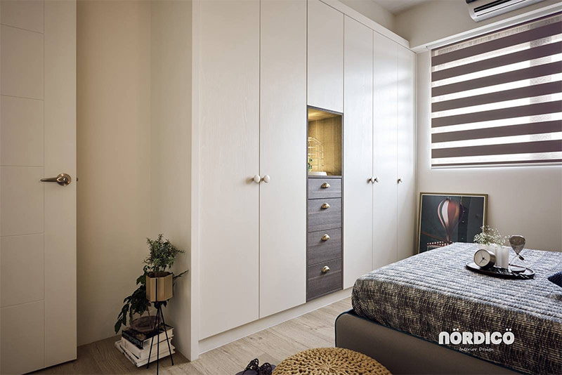
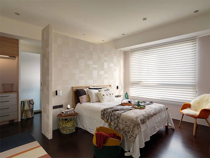
What a charming bedroom! The main idea implemented during its design is simplicity and convenience.
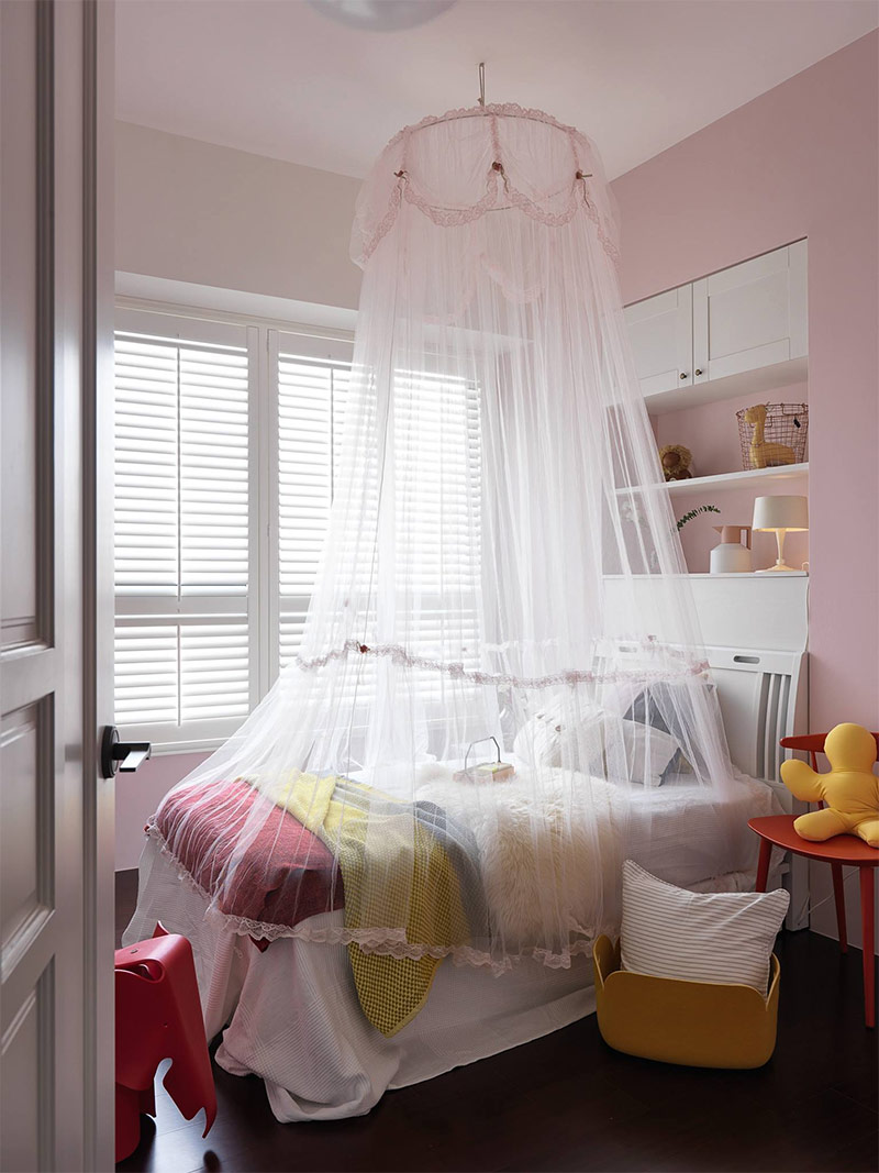
Another bedroom is designed for a child, and this can be seen at a glance - bright children's furniture, pastel color of the walls and a fancy canopy above the bed.
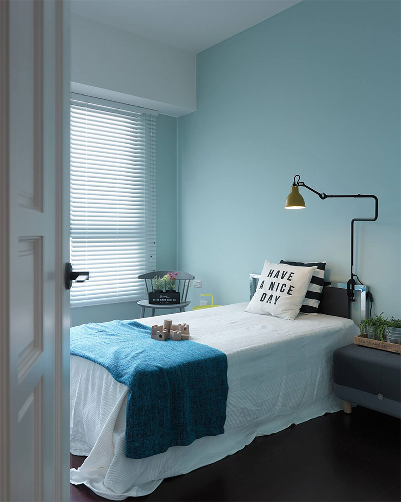
This bedroom is a bit simpler, probably intended for an older child. We can assume that the lad has an interest in gardening - just look at all these plants in tin pots.
It’s good that the children have such wonderful bedrooms in which nothing prevents them from relaxing peacefully, but do not forget that they still need to do their homework somewhere. This cozy office is ideal for reading and preparing for the new school day.
And our tour ends at the front door ...

